


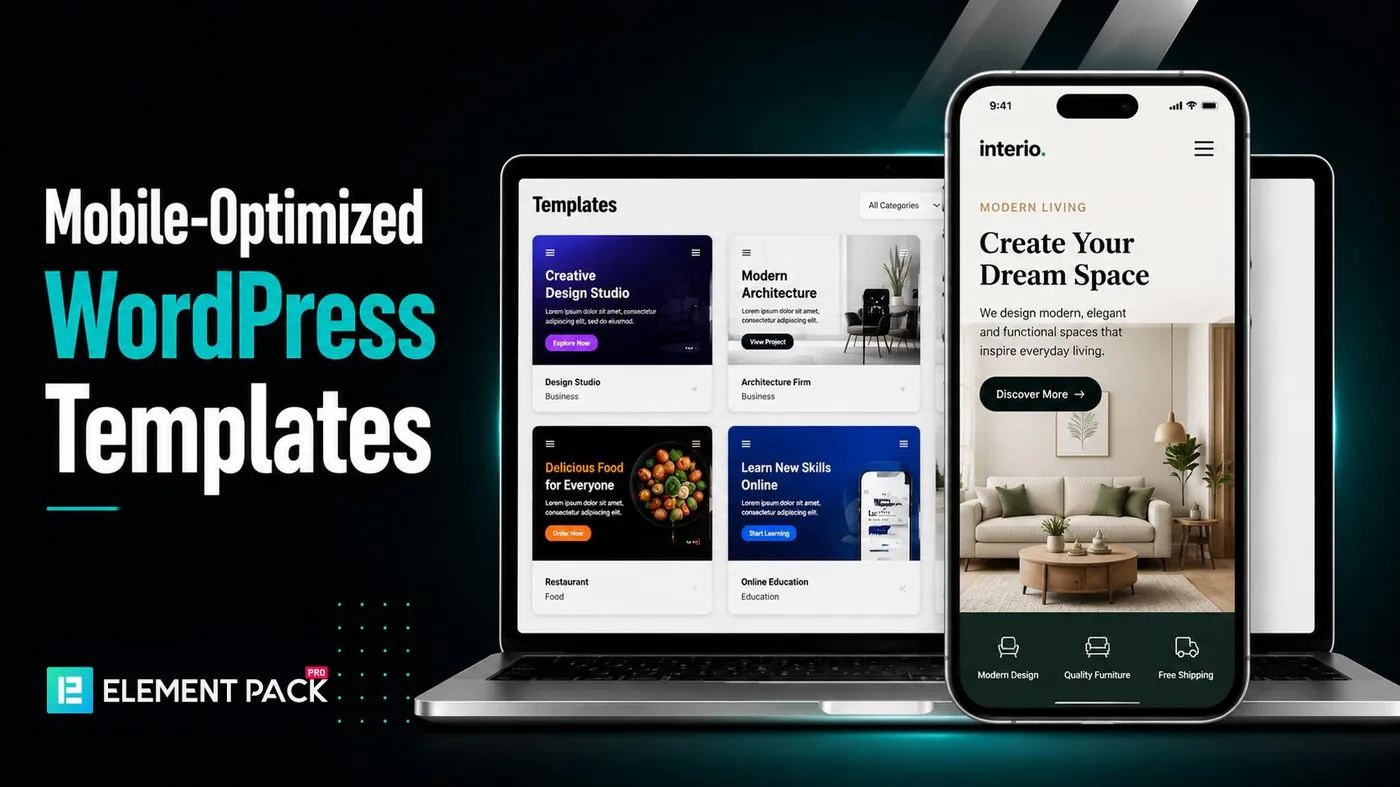
A website that looks great on a desktop but performs poorly on a smartphone can quickly drive visitors away. Many website owners choose a template without checking how well it works on different screen sizes. This can lead to slow-loading pages, poor user experience and lower search engine rankings.
The good news is that you do not have to settle for a template that only looks good. Many providers now offer WordPress Templates built with mobile users in mind. They are responsive, fast and easy to customize while delivering a consistent experience across all devices.
In this guide, you will discover the best services that provide mobile-optimized WordPress Templates. You will also learn what features to look for and how to choose a template that supports your website goals.
What is mobile optimization?

Mobile optimization is the process of designing a website so it works smoothly on smartphones, tablets and other mobile devices. A mobile-optimized WordPress template automatically adjusts layouts, images, navigation, buttons and text to fit different screen sizes, ensuring visitors enjoy a seamless browsing experience without zooming or horizontal scrolling.
Beyond responsive design, mobile optimization also focuses on fast loading speed, touch-friendly navigation, accessibility and compatibility across different browsers and devices. Since Google uses mobile-first indexing, having a mobile-friendly website is essential for improving SEO and user satisfaction.
Why Mobile Optimization Is Important
Mobile optimization is essential because most users now browse websites on smartphones and tablets. A responsive website improves user experience by making content easier to read and navigate, leading to longer visit durations and lower bounce rates.
It also supports better SEO, as Google prioritizes mobile-friendly websites in search results. Additionally, fast-loading, responsive templates can increase conversions, strengthen brand credibility and ensure your website delivers a consistent experience across all devices.
Key Factors for Mobile Optimization

Not all WordPress templates provide the same mobile experience. To ensure your website performs well on every device, look for these essential mobile optimization features.
1. Responsive Design
A responsive template automatically adjusts its layout to fit smartphones, tablets and desktops, ensuring a consistent user experience.
2. Fast Loading Speed
Lightweight code and optimized assets help pages load faster, improving both user experience and SEO performance.
3. Mobile-Friendly Navigation
Features like hamburger menus, sticky headers and touch-friendly buttons make navigation easier on smaller screens.
4. Readable Typography
Responsive typography keeps text clear and easy to read without requiring users to zoom in.
5. Responsive Images
Images should automatically resize for different screen sizes while maintaining quality and fast loading times.
6. SEO-Friendly Structure
Clean code, proper heading hierarchy and optimized performance help search engines crawl and rank your website more effectively.
7. Touch-Friendly Elements
Buttons, links and forms should be large enough and well-spaced for comfortable tapping on mobile devices.
8. Cross-Browser Compatibility
A quality template should work smoothly across major browsers and operating systems, including Chrome, Safari, Firefox, Android and iOS.
9. Regular Updates
Frequent updates improve security, fix bugs and ensure compatibility with the latest WordPress version.
10. Easy Customization
Support for drag-and-drop page builders allows you to customize layouts, colors, fonts and content without coding.
Best Mobile-Optimized WordPress Templates
Finding the right mobile-friendly WordPress template can significantly reduce development time while ensuring your website delivers an excellent experience across every device.
Whether you're building a business website, an online store, a portfolio, or a personal blog, choosing a responsive template allows you to create a professional-looking site without starting from scratch.
Below are some of the best WordPress templates optimized for mobile devices. Each one offers responsive layouts, modern design and features that help websites perform well on smartphones, tablets and desktop computers.
1. Element Pack Template Library (Editor's Choice)
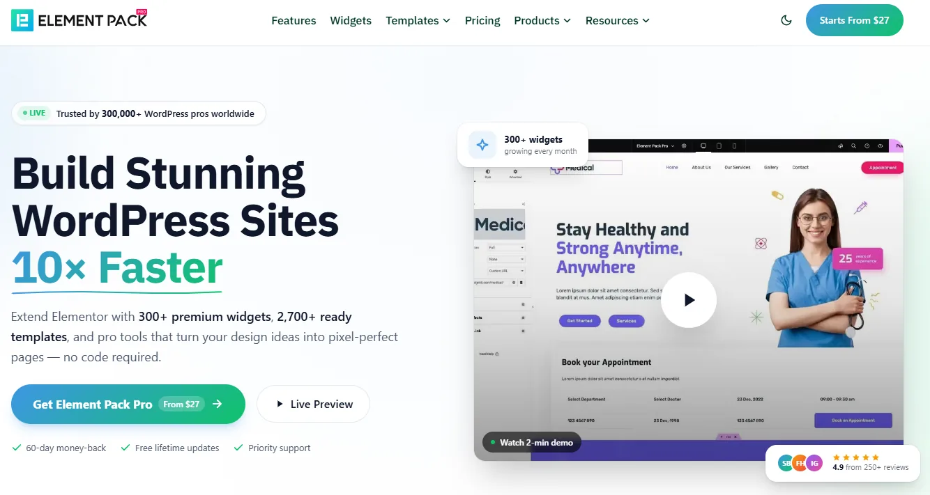
If you're looking for an all-in-one solution for creating responsive WordPress websites with Elementor, Element Pack Template Library is one of the best choices available. Rather than providing only a few page layouts, Element Pack includes an extensive collection of professionally designed templates suitable for almost every industry.
Be it a corporate website, agency portfolio, SaaS platform, online store, educational website, personal blog, or landing page, you'll find ready-made designs that can be imported with a single click.
Every template is built specifically for Elementor, making customization simple even if you have no coding experience. Instead of spending hours designing each section manually, you can import complete website kits or individual pages and modify colors, typography, images and content to match your brand.
One of Element Pack's biggest strengths is that it offers much more than templates. In addition to its large template library, it also includes hundreds of premium Elementor widgets and advanced extensions that eliminate the need for multiple third-party plugins. This helps keep your website lightweight while expanding its design capabilities.
Since mobile optimization is a priority, every template is fully responsive and adapts automatically to smartphones, tablets, laptops and desktop screens. Visitors enjoy a consistent browsing experience regardless of the device they use.
Key Features
- 2,700+ professionally designed templates
- 300+ premium Elementor widgets
- 30+ advanced Elementor extensions
- Complete website kits
- WooCommerce templates
- Landing pages
- Header and footer templates
- Portfolio layouts
- Blog templates
- Responsive design
- One-click import
- Fast-loading pages
- SEO-friendly layouts
- Regular updates
- Professional documentation
- Dedicated customer support
Best For
- Business websites
- Agencies
- Freelancers
- Online stores
- SaaS companies
- Educational websites
- Corporate websites
- Personal portfolios
- Blogs
- Service-based businesses
Pricing
For Elementor users looking to build professional websites quickly without sacrificing design quality or mobile responsiveness, Element Pack offers one of the most complete solutions available.
Free Version: Yes. Premium Price: Starts at $39/year (Element Pack Pro Personal).
2. Jevelin
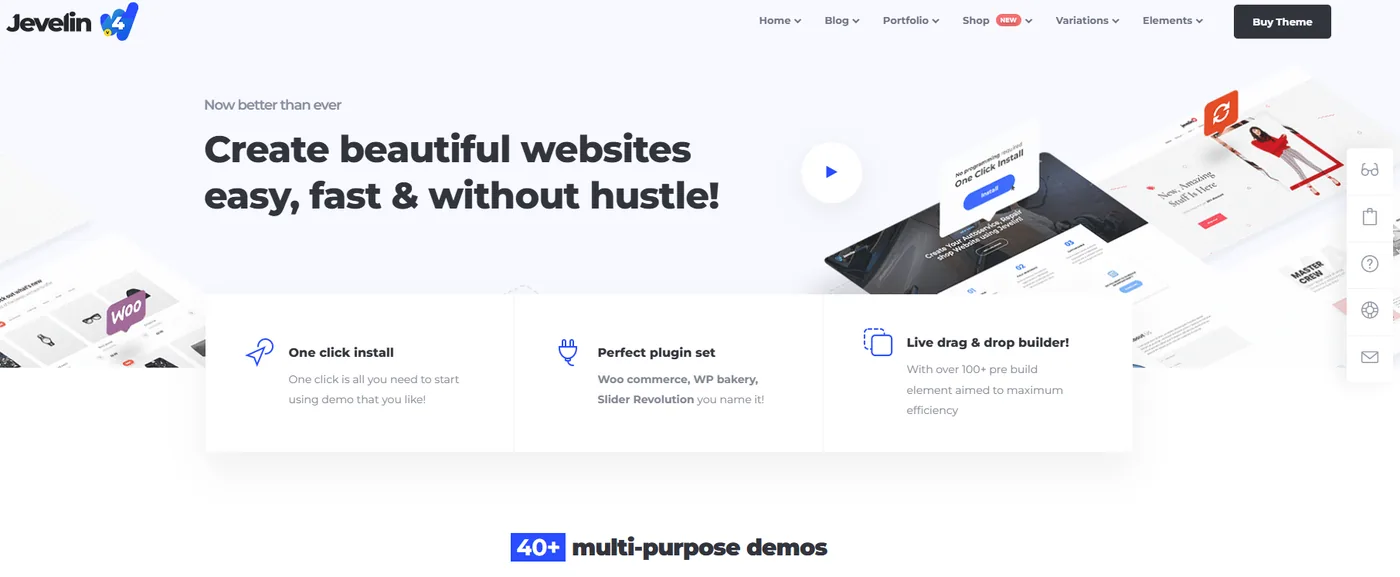
Jevelin is a powerful multipurpose WordPress theme designed to create professional websites with minimal effort. Its responsive framework ensures that every page automatically adjusts to different screen sizes, providing an excellent browsing experience on mobile devices.
The theme includes numerous pre-built demos that help users launch websites quickly without needing advanced technical skills. Whether you're building a blog, business website, online portfolio, or corporate site, Jevelin offers flexible layouts that are easy to customize.
Jevelin also integrates seamlessly with WooCommerce, allowing users to build responsive online stores that look great on smartphones and tablets. Combined with its drag-and-drop functionality and video tutorials, it remains an excellent choice for beginners and experienced developers alike.
Key Features
- Fully responsive layouts
- Multiple homepage demos
- WooCommerce support
- Portfolio templates
- Blog layouts
- RTL compatibility
- WPML support
- Drag-and-drop customization
- Fast performance
- Regular updates
Best For
- Business websites
- Creative agencies
- Personal blogs
- Online portfolios
- Small businesses
Pricing
Free Version: No. Premium Price: Starts at $59 (Regular License).
3. Kalium
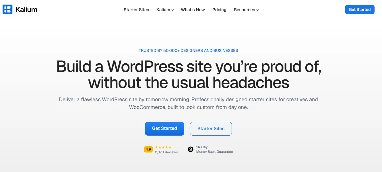
Kalium is a creative multipurpose WordPress theme that places strong emphasis on design quality and responsiveness. Every page element has been carefully optimized to look equally impressive on desktop computers and mobile devices.
Its clean layouts make Kalium particularly popular among photographers, designers, architects, agencies and creative professionals. The theme includes numerous portfolio styles, galleries and modern typography options that showcase visual content beautifully.
Kalium also supports LayerSlider and various premium plugins, making it easy to create dynamic pages while maintaining fast loading performance.
Key Features
- 100% responsive layouts
- Creative portfolio designs
- Retina-ready graphics
- WooCommerce support
- LayerSlider integration
- Multiple demos
- Typography controls
- SEO-friendly structure
- Regular updates
Best For
- Creative professionals
- Agencies
- Designers
- Photographers
- Portfolio websites
Pricing
Free Version: No. Premium Price: Starts at $59/year or $199 Lifetime.
4. Gillion
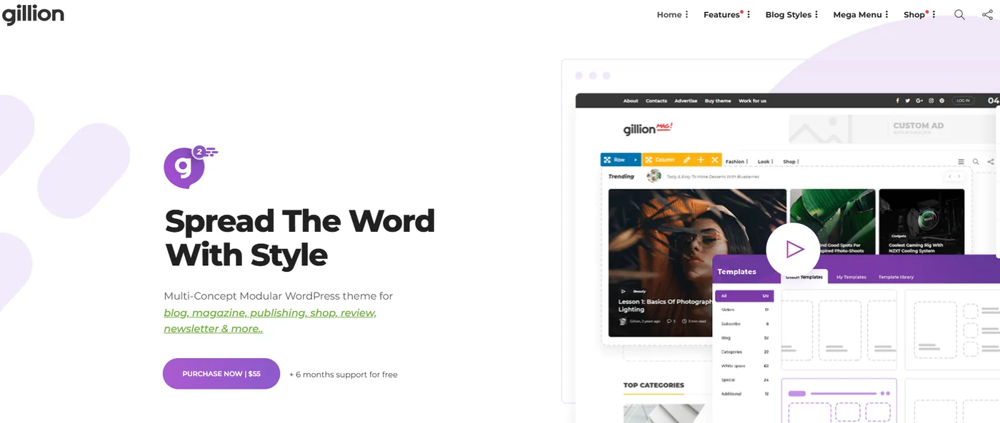
Gillion is a modern WordPress theme designed primarily for blogs, magazines and online publishers. It combines elegant design with responsive performance to ensure readers enjoy a seamless experience across every device.
The theme includes multiple homepage layouts, customizable headers, review systems, social sharing features and various blog styles that make content presentation highly engaging.
Since mobile reading continues to grow each year, Gillion focuses heavily on typography, spacing and page speed to improve readability on smartphones and tablets.
Key Features
- Mobile-responsive design
- Multiple blog layouts
- Magazine templates
- Social media integration
- Review system
- Sticky navigation
- SEO optimization
- Fast loading pages
- WPBakery support
Best For
- Bloggers
- News websites
- Online magazines
- Content creators
- Affiliate websites
Pricing
Free Version: No. Premium Price: Starts at $59 (Regular License).
5. Soledad
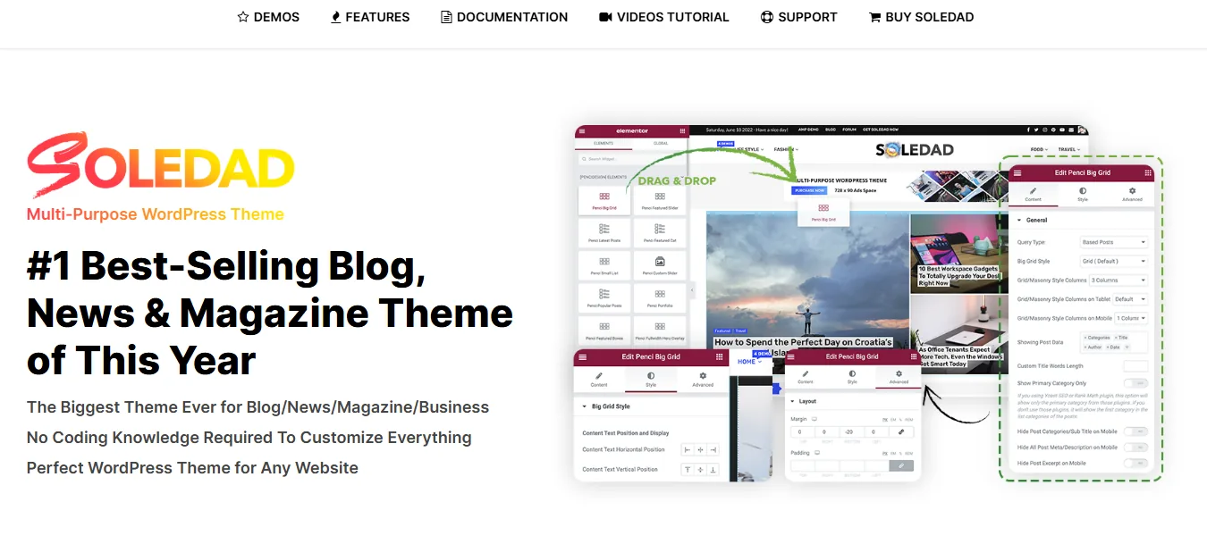
Soledad is one of the most versatile WordPress themes available for blogs and online magazines. It includes hundreds of homepage variations and thousands of layout combinations, allowing users to create highly unique websites without writing code.
Built on a responsive framework, Soledad automatically adapts every layout to different devices. Its touch-friendly design, flexible customization options and lightweight structure make it an excellent choice for mobile-first publishing.
The theme also includes extensive customization controls that allow users to modify colors, fonts, spacing and layouts while maintaining consistent responsiveness.
Key Features
- Hundreds of homepage demos
- Responsive Bootstrap framework
- Mobile-friendly navigation
- SEO-ready design
- Multiple article layouts
- WooCommerce support
- Optimized typography
- Fast loading
- Regular updates
Best For
- Blogs
- Online magazines
- News websites
- Review websites
- Lifestyle websites
Pricing
Free Version: No. Premium Price: Starts at $59 (Regular License).
6. Divi
Divi has become one of the most recognizable WordPress themes thanks to its powerful visual builder and extensive design flexibility. Rather than relying on traditional coding, users can create fully responsive websites using an intuitive drag-and-drop interface.
One of Divi's strongest advantages is its responsive editing controls. Users can customize layouts separately for desktop, tablet and mobile devices, ensuring every visitor receives an optimized experience regardless of screen size.
Divi also includes hundreds of professionally designed layouts suitable for businesses, agencies, restaurants, online stores, healthcare providers and many other industries.
Key Features
- Visual drag-and-drop builder
- Responsive editing
- Hundreds of layouts
- Global design controls
- WooCommerce compatibility
- Marketing integrations
- Split testing
- Lifetime license option
- Excellent documentation
Best For
- Agencies
- Freelancers
- Small businesses
- Corporate websites
- Marketing websites
Pricing
Free Version: No. Premium Price: Starts at $89/year or $249 Lifetime.
7. Webify
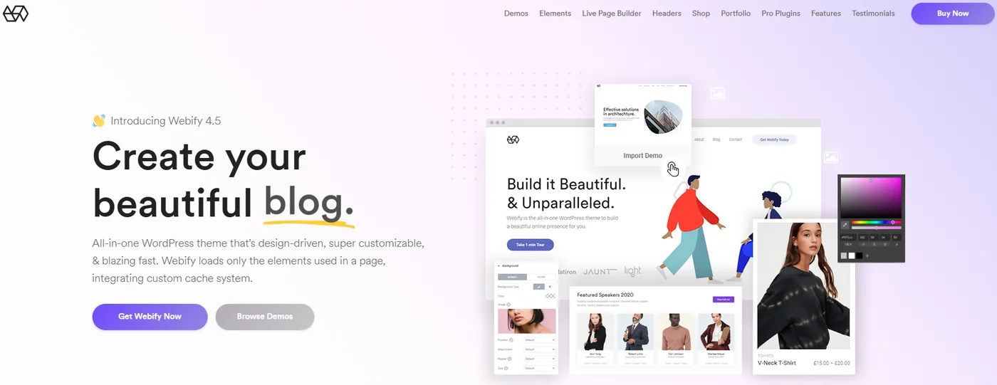
Webify is a modern multipurpose WordPress theme known for its impressive speed and mobile responsiveness. Every template is carefully optimized to deliver excellent performance while maintaining an attractive visual design.
The theme includes numerous homepage demos, customizable headers, reusable blocks and flexible layout options that simplify website development. Because Webify is lightweight, pages load quickly even on slower mobile networks.
Its responsive design ensures visitors enjoy a consistent experience whether browsing from smartphones, tablets, laptops, or desktop computers.
Key Features
- Lightweight framework
- Responsive layouts
- Fast page speed
- WooCommerce support
- Multiple demos
- Custom headers
- Drag-and-drop editing
- SEO optimization
- Retina-ready design
Best For
- Business websites
- Agencies
- Corporate websites
- Freelancers
- Landing pages
Pricing
Free Version: No. Premium Price: Starts at $59 (Regular License).
8. Uncode
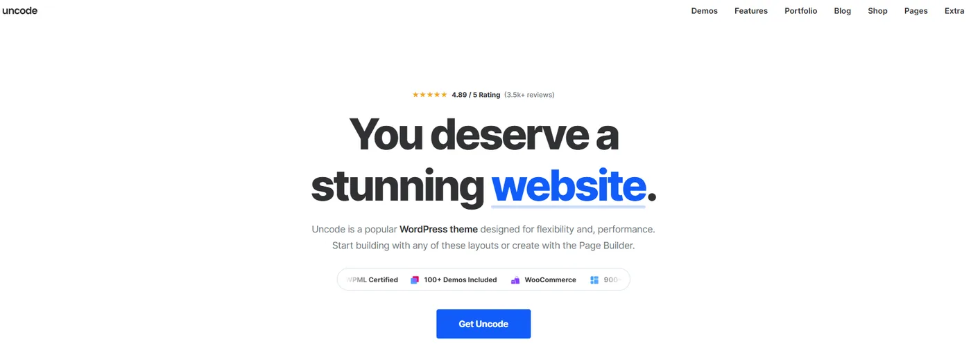
Uncode is a highly flexible multipurpose WordPress theme built for users who want complete creative freedom without compromising performance. It combines premium design quality with excellent mobile responsiveness and extensive customization options.
The theme includes advanced portfolio layouts, WooCommerce compatibility, responsive galleries, touch-friendly navigation and smooth animations that work seamlessly across modern devices.
Uncode also supports WPBakery, along with exclusive design modules that enable users to create sophisticated layouts while maintaining fast load times.
Key Features
- Fully responsive framework
- Advanced portfolio layouts
- WooCommerce integration
- Touch-friendly navigation
- WPML compatibility
- Premium sliders
- Fast performance
- Creative animations
- Regular updates
Best For
- Agencies
- Designers
- Creative studios
- Business websites
- Online portfolios
Pricing
Free Version: No. Premium Price: Starts at $59 (Regular License).
9. X Theme
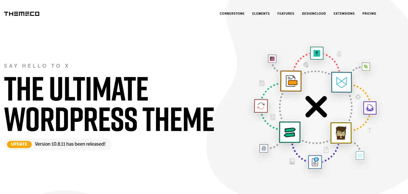
X Theme has earned a strong reputation as one of the most flexible multipurpose WordPress themes on the market. Built with responsiveness at its core, it ensures your website looks professional and functions smoothly on smartphones, tablets, laptops and desktop computers.
One of the reasons many website owners choose X Theme is its powerful customization capabilities. It includes multiple design systems, known as "Stacks," allowing users to create completely different website styles without changing themes. Combined with its intuitive page builder and responsive controls, X Theme makes building mobile-friendly websites straightforward.
The theme also integrates seamlessly with WooCommerce, making it an excellent choice for businesses looking to create responsive online stores.
Key Features
- Fully responsive layouts
- Multiple design stacks
- WooCommerce integration
- Drag-and-drop page builder
- Retina-ready graphics
- SEO-friendly structure
- Fast loading performance
- Regular updates
Best For
- Business websites
- Online stores
- Corporate websites
- Agencies
- Service providers
Pricing
Free Version: No. Premium Price: Starts at $59 (Regular License).
10. Hongo
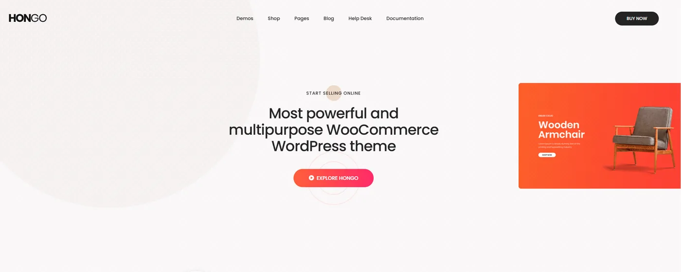
Hongo is a premium WordPress theme built specifically for modern eCommerce websites. Every page is carefully optimized for an excellent mobile shopping experience, making it ideal for online retailers.
Its responsive product layouts, quick product previews, optimized checkout pages and flexible customization options help businesses create attractive online stores that convert visitors into customers.
Built with Elementor compatibility and WooCommerce support, Hongo makes launching an online store easier than ever.
Key Features
- Responsive online store layouts
- WooCommerce ready
- Elementor compatible
- Product quick view
- Modern shop pages
- Fast loading
- Mobile-friendly checkout
- One-click demo import
Best For
- Fashion stores
- Electronics stores
- Online retailers
- Beauty brands
- eCommerce businesses
Pricing
Free Version: No. Premium Price: Starts at $59 (Regular License).
11. Total
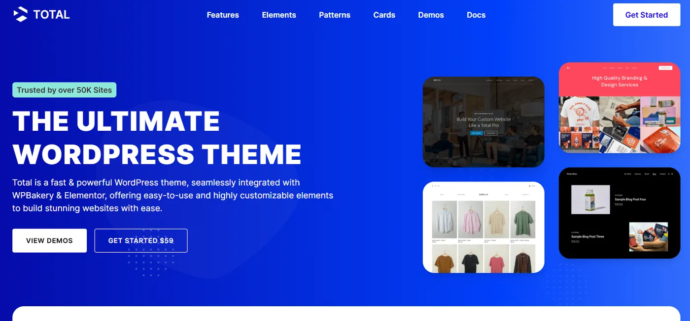
As its name suggests, Total is designed to be a complete website-building solution. It includes a wide variety of demos, templates and customization options suitable for almost any industry.
The theme is fully responsive and optimized for performance, ensuring websites load quickly while maintaining an attractive appearance across different devices.
Its live customization features make it easy for beginners to personalize websites without coding.
Key Features
- Multipurpose design
- Responsive layouts
- Live customizer
- WooCommerce support
- One-click demo import
- Lightweight framework
- SEO-friendly coding
- Regular updates
Best For
- Agencies
- Business websites
- Corporate sites
- Freelancers
- Service providers
Pricing
Free Version: No. Premium Price: Starts at $59 (Regular License).
12. Litho
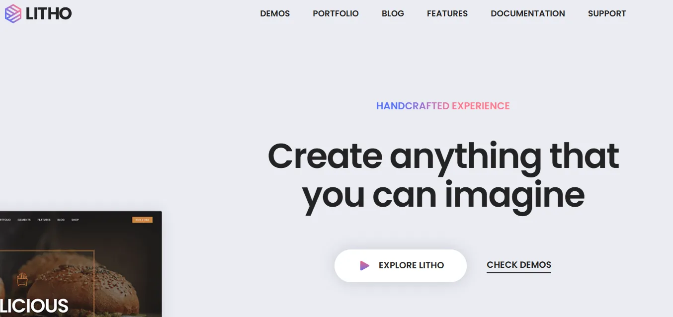
Litho combines beautiful modern design with outstanding performance. Built for Elementor users, it offers hundreds of page templates and design elements that simplify website creation.
Every layout is responsive by default, ensuring visitors enjoy a smooth browsing experience regardless of screen size.
Litho also focuses heavily on page speed and Core Web Vitals, helping websites perform well in search results.
Key Features
- 300+ page templates
- Elementor support
- Responsive layouts
- WooCommerce ready
- High-speed performance
- Creative demos
- SEO-friendly
- Modern typography
Best For
- Agencies
- Creative businesses
- Startups
- Online stores
- Landing pages
Pricing
Free Version: No. Premium Price: Starts at $59 (Regular License).
13. POFO
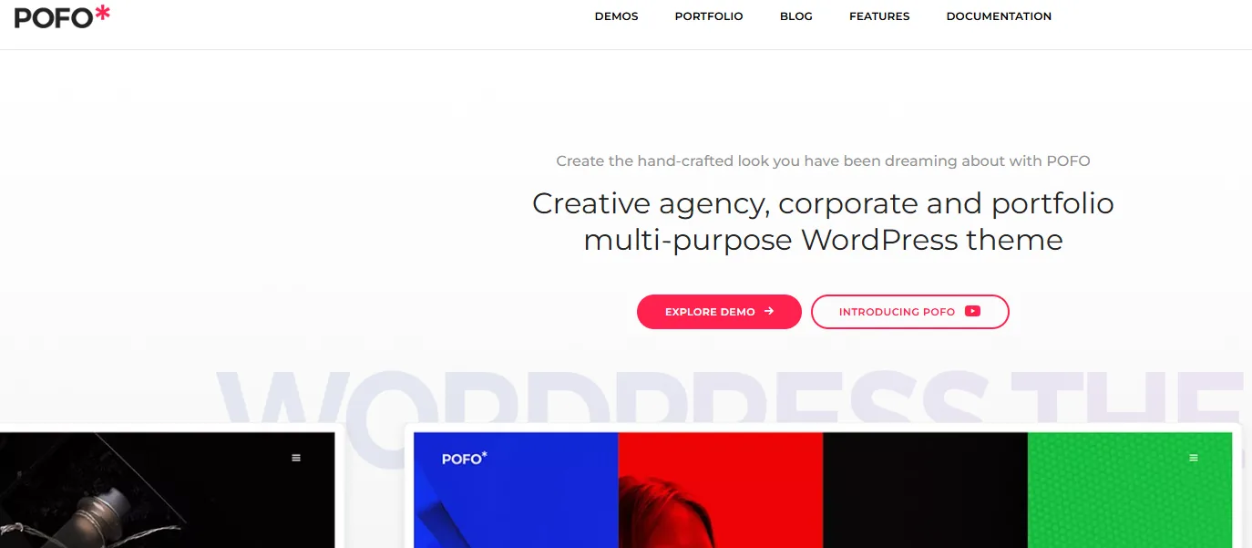
POFO is a lightweight creative portfolio theme that focuses on visual storytelling. It offers elegant layouts perfect for photographers, designers, artists and agencies looking to showcase their work professionally.
Its responsive framework ensures every portfolio adapts beautifully to smartphones and tablets while maintaining fast loading performance.
Key Features
- Portfolio layouts
- Landing page templates
- Lightweight design
- Responsive framework
- WooCommerce compatibility
- WPBakery integration
- Fast performance
- Creative animations
Best For
- Designers
- Artists
- Photographers
- Creative agencies
- Personal portfolios
Pricing
Free Version: No. Premium Price: Starts at $59 (Regular License).
14. H-Code
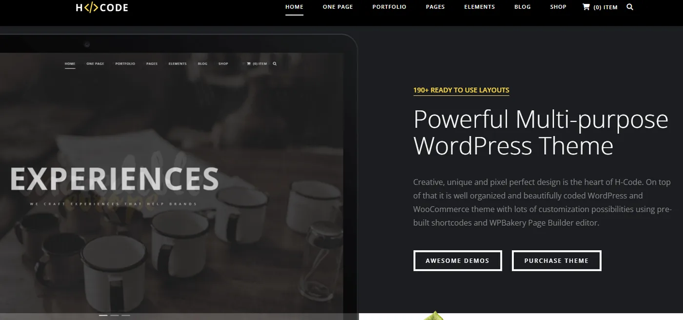
H-Code is a high-performance multipurpose WordPress theme designed for businesses that require flexibility and speed.
Its responsive design automatically adjusts content for different devices while providing numerous customization options, animations and layout controls.
Key Features
- Responsive layouts
- WooCommerce support
- Unlimited sidebars
- CSS3 animations
- Retina-ready graphics
- SEO optimization
- WPML support
- One-click installation
Best For
- Corporate websites
- Agencies
- Online stores
- Startups
- Business websites
Pricing
Free Version: No. Premium Price: Starts at $59 (Regular License).
15. Doyle
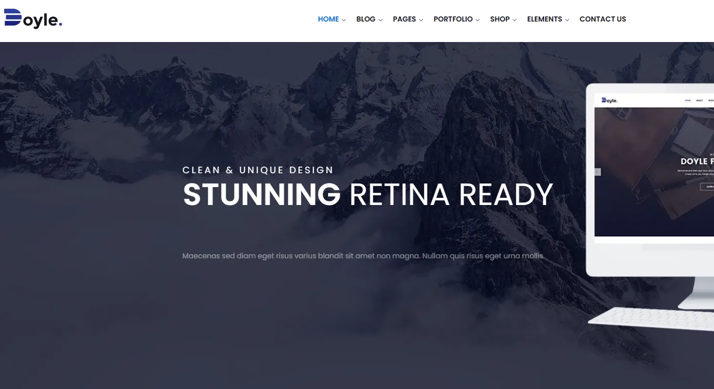
Doyle offers a clean and minimalist approach to WordPress website design. Instead of overwhelming users with excessive visual effects, it emphasizes readability and elegant presentation.
The theme works beautifully on mobile devices and includes multilingual support, Google Fonts integration and responsive portfolio layouts.
Key Features
- Minimalist design
- Responsive layouts
- Google Fonts
- WPML compatibility
- Portfolio pages
- Blog layouts
- Lightweight code
- Fast loading
Best For
- Personal brands
- Creative professionals
- Bloggers
- Consultants
- Agencies
Pricing
Free Version: No. Premium Price: Starts at $59 (Regular License).
16. Saxon
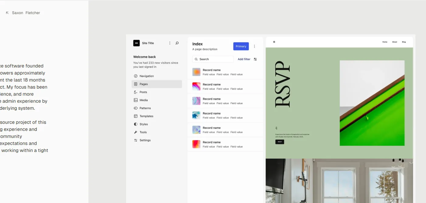
Saxon is a responsive WordPress theme developed primarily for blogs, magazines and viral content websites.
Its layouts are optimized for mobile reading, ensuring articles remain easy to browse across smartphones and tablets.
Key Features
- Mobile-first design
- Multiple blog demos
- Responsive layouts
- Sticky navigation
- SEO-friendly coding
- Fast performance
- Social sharing
- Advertisement support
Best For
- Bloggers
- Online magazines
- News portals
- Affiliate websites
- Content creators
Pricing
Free Version: No. Premium Price: Starts at $59 (Regular License).
17. Seofy

Seofy is designed specifically for digital marketing agencies, SEO companies, startups and consultants.
It combines responsive layouts with marketing-focused sections such as pricing tables, testimonials, lead generation forms and service pages.
Key Features
- Responsive business layouts
- SEO-friendly design
- Pricing tables
- Service pages
- Fast loading
- Newsletter integration
- Translation ready
- Modern animations
Best For
- SEO agencies
- Marketing agencies
- Consultants
- Startups
- SaaS businesses
Pricing
Free Version: No. Premium Price: Starts at $59 (Regular License).
18. Brando
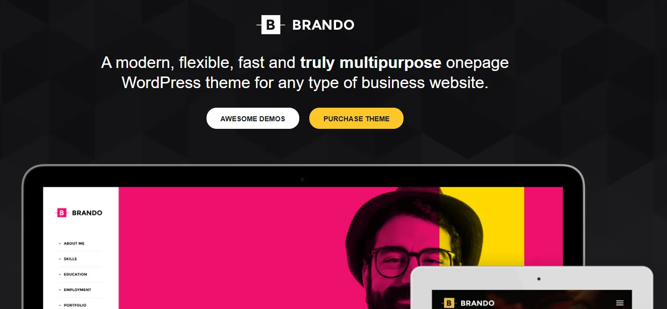
Brando is a one-page WordPress theme that delivers impressive performance across all screen sizes.
Its responsive layouts, smooth animations and lightweight structure make it particularly suitable for agencies, startups and creative businesses.
Key Features
- One-page layouts
- Responsive design
- Portfolio templates
- Landing pages
- WooCommerce support
- WPML compatibility
- Fast loading
- Regular updates
Best For
- Agencies
- Landing pages
- Freelancers
- Startups
- Small businesses
Pricing
Free Version: No. Premium Price: Starts at $59 (Regular License).
19. Ceris
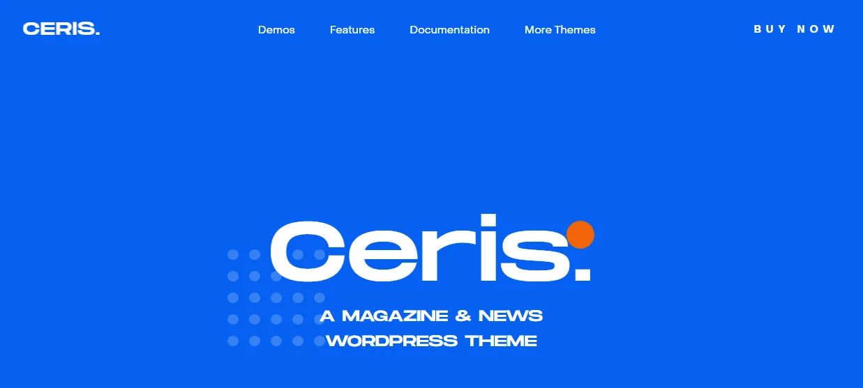
Ceris is a powerful WordPress theme built for news websites, blogs and online magazines.
With numerous responsive demos and customization options, it allows publishers to create modern content-focused websites that perform exceptionally well on mobile devices.
Key Features
- Magazine layouts
- Responsive framework
- Social login
- Mega menu
- Review system
- Sticky sidebar
- WooCommerce support
- Fast loading
Best For
- News websites
- Online magazines
- Bloggers
- Publishers
- Editorial websites
Pricing
Free Version: No. Premium Price: Starts at $59 (Regular License).
20. Essentials
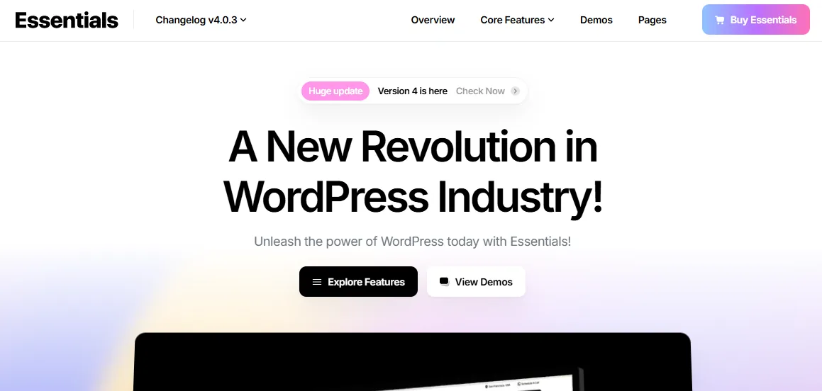
Essentials offers one of the largest collections of ready-made templates among premium WordPress themes.
Its responsive layouts, flexible design controls and compatibility with major page builders make it suitable for virtually any website.
Key Features
- 600+ templates
- Responsive layouts
- Popup builder
- WooCommerce support
- Sticky header
- WPML compatibility
- Fast loading
- Modern design
Best For
- Agencies
- Businesses
- Online stores
- Creative professionals
- Corporate websites
Pricing
Free Version: No. Premium Price: Starts at $59 (Regular License).
21. Sassico
Sassico is built for SaaS businesses, startups, software companies and technology firms.
Its responsive layouts prioritize conversion, offering modern landing pages, pricing tables, feature sections and call-to-action blocks optimized for every device.
Key Features
- Startup demos
- Responsive layouts
- Elementor support
- Modern landing pages
- Pricing tables
- Smooth animations
- Fast performance
- SEO optimization
Best For
- SaaS companies
- Software businesses
- Startups
- Technology firms
- Mobile apps
Pricing
Free Version: No. Premium Price: Starts at $59 (Regular License).
22. TheFox
TheFox is a highly customizable multipurpose WordPress theme suitable for businesses of all sizes.
It includes dozens of homepage variations while maintaining excellent responsiveness and fast loading performance.
Key Features
- 30+ homepage demos
- Fully responsive
- WooCommerce support
- Portfolio layouts
- Custom widgets
- Retina-ready graphics
- SEO-friendly code
- Regular updates
Best For
- Business websites
- Agencies
- Portfolios
- Freelancers
- Service companies
Pricing
Free Version: No. Premium Price: Starts at $59 (Regular License).
23. Avada
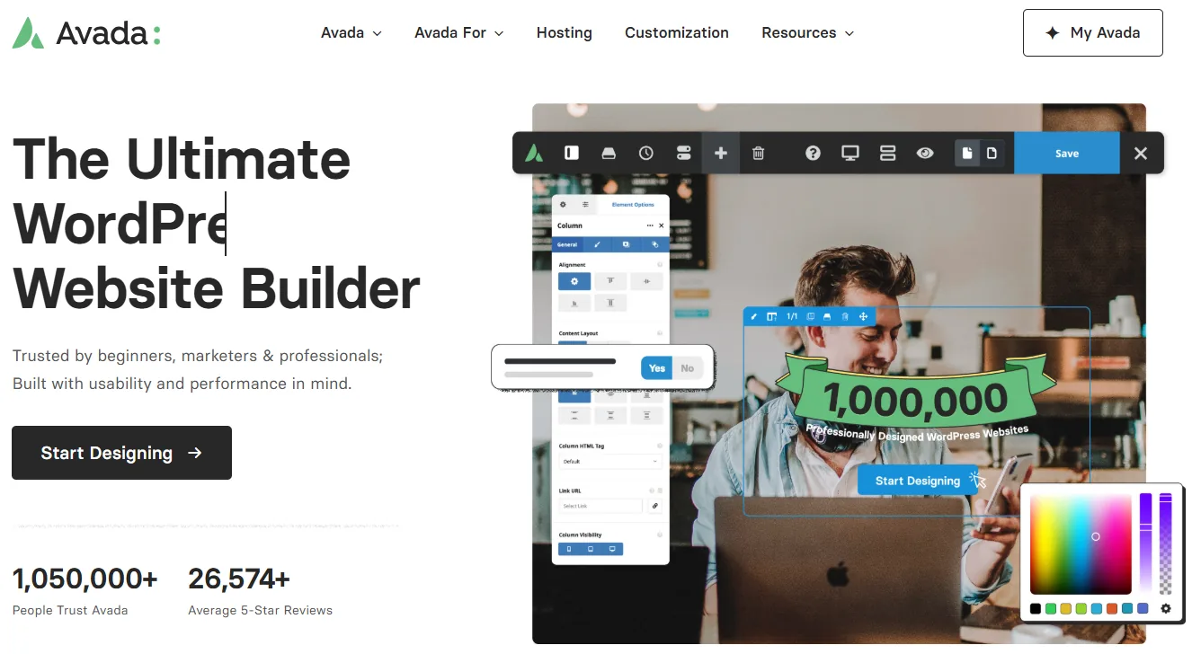
Avada is one of the best-selling WordPress themes of all time, trusted by millions of website owners worldwide.
Its responsive framework, visual builder, extensive demo library and exceptional flexibility make it suitable for virtually every industry.
Key Features
- Responsive layouts
- Visual Builder
- One-click demo import
- WooCommerce support
- Performance optimization
- SEO-ready structure
- Header builder
- Lifetime updates
Best For
- Businesses
- Agencies
- Online stores
- Corporate websites
- Multipurpose websites
Pricing
Free Version: No. Premium Price: Starts at $69 (Regular License).
24. Ronneby
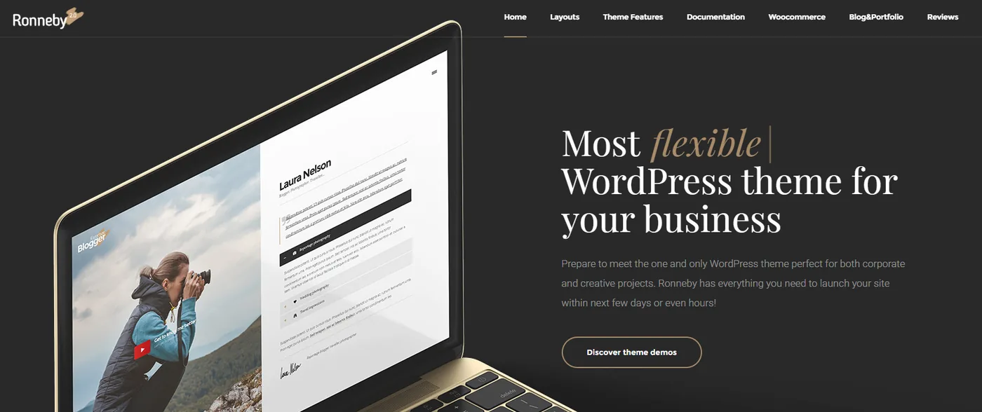
Ronneby combines elegant design with powerful customization tools.
Its responsive framework ensures every website looks polished across smartphones, tablets and desktops while maintaining excellent page speed.
Key Features
- Responsive layouts
- Portfolio templates
- WooCommerce support
- One-click demo import
- Premium plugins included
- Modern typography
- SEO optimization
- Fast loading
Best For
- Creative agencies
- Business websites
- Designers
- Online portfolios
- Freelancers
Pricing
Free Version: No. Premium Price: Starts at $59 (Regular License).
25. Bridge
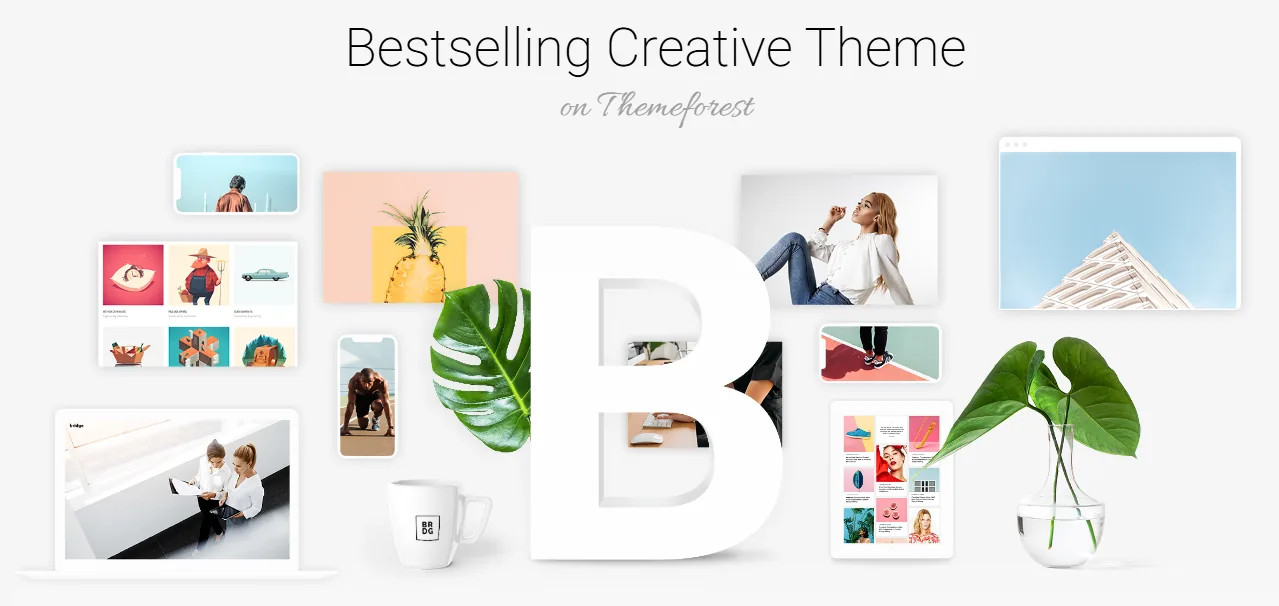
Bridge is one of the most versatile and feature-rich WordPress themes available today. Designed for businesses, creative professionals, agencies, online stores and corporate websites, it offers hundreds of professionally designed demos that are fully responsive and optimized for mobile devices.
One of Bridge's biggest advantages is its massive collection of ready-made layouts. Instead of building a website from scratch, users can import a complete demo with a single click and customize it to suit their brand. Every layout is designed to adapt seamlessly to smartphones, tablets, laptops and desktop screens, ensuring a consistent browsing experience for all visitors.
Bridge also integrates with popular page builders and WooCommerce, making it easy to create business websites, portfolios, blogs and online stores without extensive coding knowledge.
Key Features
- 600+ professionally designed demos
- Fully responsive layouts
- One-click demo import
- WooCommerce compatibility
- SEO-friendly structure
- Fast loading performance
- Visual page builder support
- Regular updates
- Premium customer support
Best For
- Business websites
- Creative agencies
- Corporate websites
- Online stores
- Freelancers
- Multipurpose websites
Pricing
Free Version: No. Premium Price: Starts at $69 (Regular License).
26. Salient
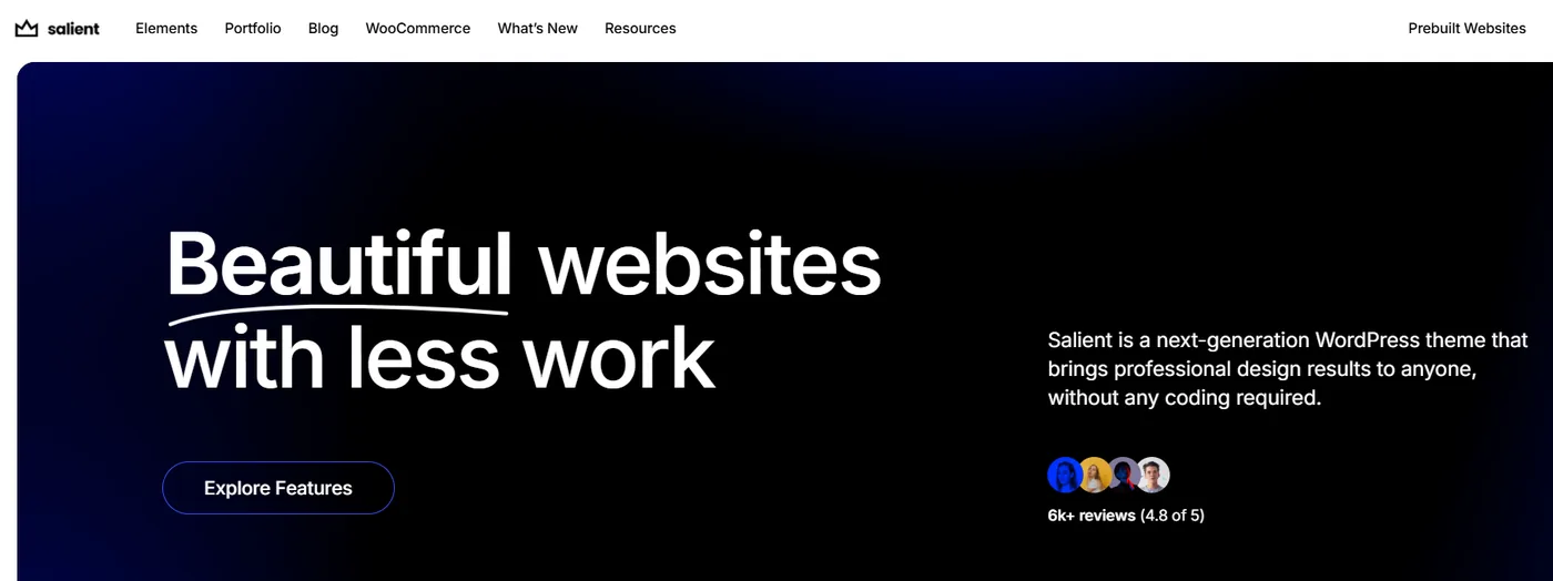
Salient is a premium multipurpose WordPress theme known for its elegant design, smooth animations and outstanding performance across all devices. Whether you're building a business website, portfolio, online store, or creative agency site, Salient provides a responsive foundation that automatically adapts to different screen sizes.
One of Salient's biggest strengths is its intuitive visual page builder, which allows users to create stunning layouts without coding. Every template is optimized for mobile devices, ensuring that images, typography, buttons and navigation remain easy to use on smartphones and tablets.
The theme also emphasizes speed and clean code, helping websites load quickly while delivering a polished user experience.
Key Features
- Fully responsive design
- Visual drag-and-drop builder
- WooCommerce compatibility
- SEO-friendly structure
- Fast-loading pages
- Advanced typography controls
- Responsive image support
- Regular updates
Best For
- Business websites
- Creative agencies
- Portfolios
- Online stores
- Corporate websites
Pricing
Free Version: No. Premium Price: Starts at $69 (Regular License).
27. Workreap
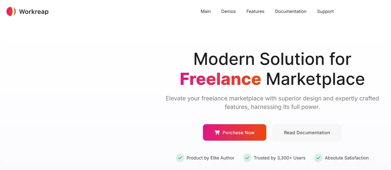
Workreap is a feature-rich WordPress theme built specifically for freelance marketplaces and service-based platforms. Designed with responsiveness in mind, it provides a seamless experience for freelancers, employers and clients using smartphones, tablets, or desktop computers.
The theme includes advanced marketplace functionality such as freelancer profiles, project listings, secure messaging and online payment support. Despite offering powerful features, Workreap remains highly responsive and optimized for mobile users, making it easy to manage projects or browse services from any device.
Key Features
- Responsive marketplace design
- Freelancer and employer dashboards
- Real-time messaging
- WooCommerce integration
- Secure payment support
- One-click demo import
- Fast loading performance
- SEO-friendly coding
Best For
- Freelance marketplaces
- Service directories
- Job portals
- Online service platforms
- Business directories
Pricing
Free Version: No. Premium Price: Starts at $69 (Regular License).
28. Avantage
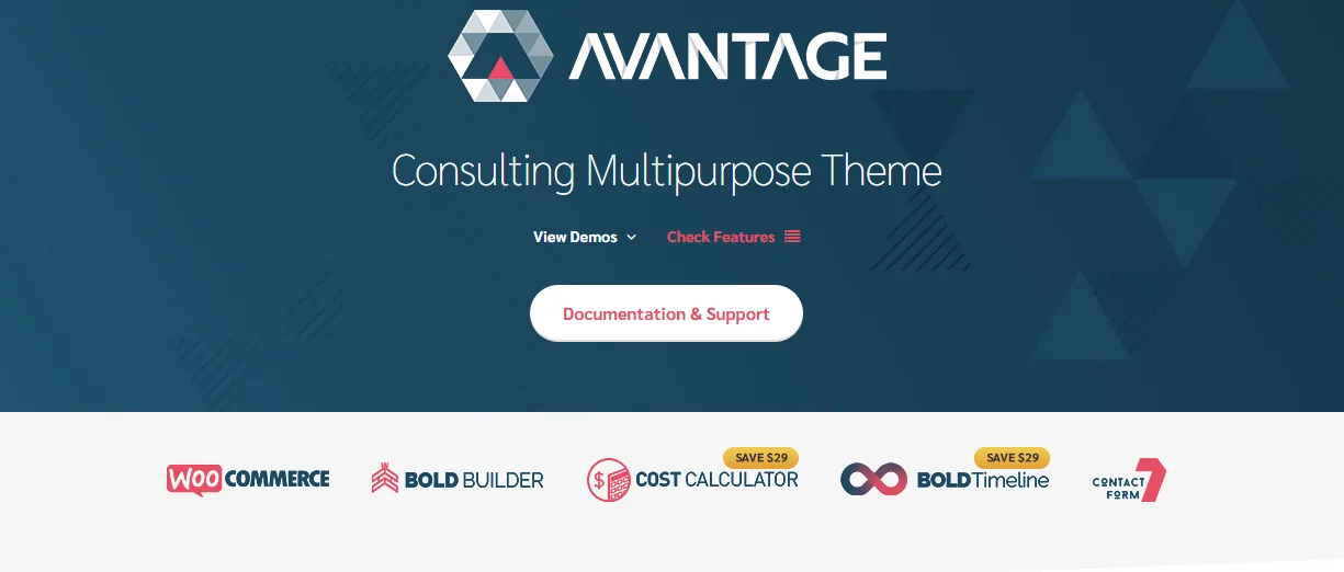
Avantage is a professional WordPress theme developed for consulting firms, financial advisors, marketing agencies and business consultants. It combines a clean, modern design with mobile-friendly layouts that ensure visitors can easily access services and company information from any device.
The theme includes professionally designed homepage layouts, service pages, case studies, pricing tables and team sections. Its responsive framework automatically adjusts every element for smaller screens while maintaining readability and usability.
Avantage also focuses on speed and SEO, helping businesses create websites that perform well in search engines and deliver a positive user experience.
Key Features
- Responsive business layouts
- Consulting-focused demos
- SEO-friendly structure
- Fast page loading
- WooCommerce support
- Multiple header layouts
- Translation ready
- Regular updates
Best For
- Consulting firms
- Financial advisors
- Marketing agencies
- Business consultants
- Corporate websites
Pricing
Free Version: No. Premium Price: Starts at $69 (Regular License).
29. Koncrete
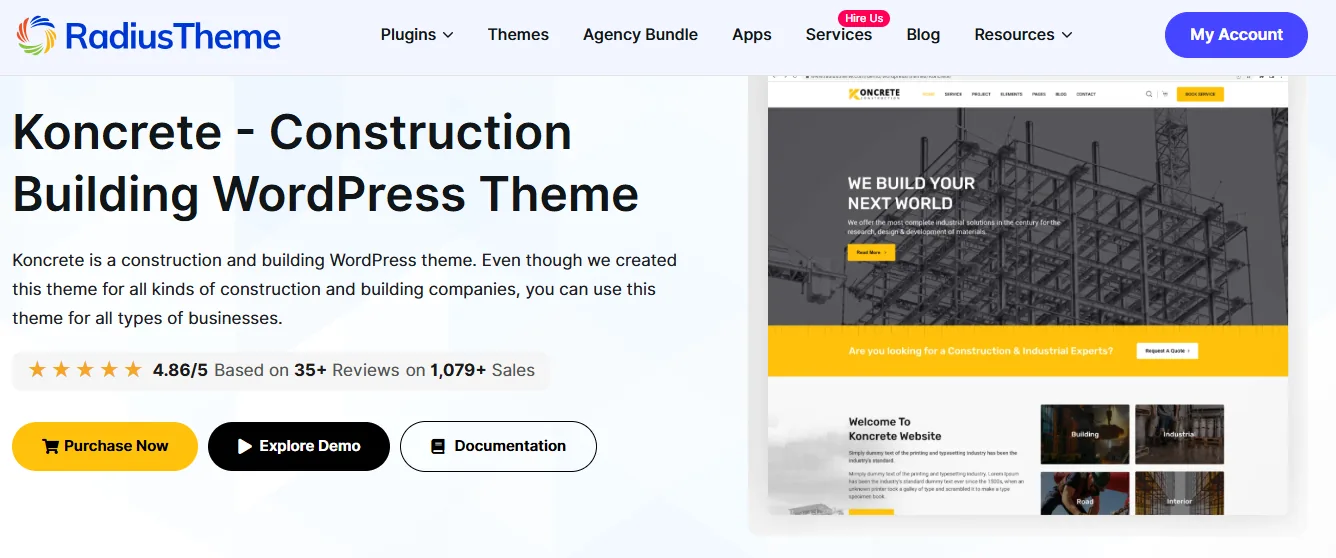
Koncrete is a modern WordPress theme designed for construction companies, contractors, architects, engineering firms and industrial businesses. Every template is built with a responsive layout that automatically adapts to mobile devices, ensuring potential clients can browse projects and services with ease.
The theme includes multiple homepage designs, project galleries, service pages, testimonials and contact sections. Built with Elementor compatibility, Koncrete lets users customize layouts with a simple drag-and-drop interface, without writing code.
Its lightweight structure and optimized performance make it an excellent choice for businesses looking to build fast, professional websites.
Key Features
- Elementor compatible
- Fully responsive layouts
- Construction-focused demos
- Project showcase pages
- WooCommerce support
- One-click demo import
- SEO optimization
- Fast loading performance
Best For
- Construction companies
- Contractors
- Engineering firms
- Architects
- Industrial businesses
Pricing
Free Version: No. Premium Price: Starts at $59 (Regular License).
Benefits of Using Mobile-Optimized WordPress Templates
Choosing a mobile-friendly WordPress template offers far more than just a better-looking website. It directly impacts user experience, search engine rankings, engagement and business growth. Below are some of the biggest advantages of using mobile-optimized templates.
1. Improved User Experience
Visitors expect websites to work perfectly on every device. Mobile-optimized templates automatically adjust layouts, images, menus and buttons, making navigation simple and intuitive. A better browsing experience encourages users to stay longer and explore more pages.
2. Better Search Engine Rankings
Google primarily evaluates the mobile version of a website when determining search rankings. Responsive templates help improve technical SEO by providing clean code, fast loading speeds and a mobile-friendly structure, all of which contribute to better visibility in search results.
3. Faster Page Loading
Modern mobile templates are built with lightweight code and optimized assets, helping pages load quickly even on slower mobile networks. Faster websites reduce bounce rates and improve overall user satisfaction.
4. Increased Conversion Rates
Whether you're collecting leads, selling products, or promoting services, mobile-friendly websites make it easier for visitors to complete actions. Clear navigation, touch-friendly buttons and streamlined forms all contribute to higher conversion rates.
5. Consistent Branding Across Devices
A responsive template ensures your branding remains consistent across screen sizes. Logos, typography, colors and images appear professional across smartphones, tablets, laptops and desktops.
6. Easier Website Management
Instead of maintaining separate desktop and mobile versions of a website, responsive templates let you manage a single site that automatically adapts to any device.
7. Future-Proof Design
Technology evolves rapidly, with new devices and screen sizes appearing every year. Mobile-optimized templates use flexible layouts that continue to perform well as technology changes.
8. Higher Customer Satisfaction
Visitors appreciate websites that load quickly, display properly and are easy to navigate. A positive user experience often leads to repeat visits, stronger customer relationships and increased trust.
Common Mistakes to Avoid When Choosing a Mobile-Friendly WordPress Template
While there are many excellent templates available, choosing the wrong one can negatively impact your website's performance. Here are some common mistakes to avoid.
Choosing Design Over Performance
A visually impressive template isn't always the best choice. Heavy animations, excessive effects and large media files can significantly slow down your website, especially on mobile devices.
Ignoring Mobile Testing
Many users only preview a template on a desktop computer before purchasing. Always test live demos on smartphones and tablets to ensure the layout remains responsive and easy to navigate.
Installing Too Many Plugins
Adding numerous plugins can slow down a website and cause compatibility issues. Choosing a feature-rich template with built-in functionality often reduces the need for additional plugins.
Forgetting About SEO
A beautiful website won't generate traffic if search engines struggle to crawl it. Choose templates that follow modern SEO best practices, including clean HTML, fast loading speeds and responsive layouts.
Not Checking Update History
Templates that haven't been updated for several years may have compatibility or security issues. Always choose products that receive regular updates and ongoing maintenance.
Ignoring Customer Support
Reliable support becomes invaluable whenever you encounter technical problems. Before purchasing a template, review the documentation, support options and user feedback provided by the developer.
Frequently Asked Questions (FAQs)
What is a mobile-optimized WordPress template?
A mobile-optimized WordPress template is a professionally designed layout that automatically adjusts its appearance and functionality across smartphones, tablets, laptops and desktop computers. It ensures visitors enjoy a consistent browsing experience regardless of their device.
Why is mobile optimization important for SEO?
Google uses mobile-first indexing, meaning it primarily evaluates the mobile version of your website when determining search rankings. Mobile-friendly templates improve usability, page speed and overall website performance, all of which contribute to better SEO.
Can I customize mobile layouts separately?
Yes. Many modern WordPress themes and page builders allow you to customize layouts independently for desktop, tablet and mobile devices. This gives you greater control over spacing, typography, visibility and content placement.
Which template is best for Elementor users?
If you're using Elementor, the Element Pack Template Library is an excellent option. It offers thousands of professionally designed templates, complete website kits, premium widgets and advanced extensions that make building responsive websites faster and easier.
Are premium templates better than free templates?
Free templates are suitable for basic websites, but premium templates generally provide better design quality, more customization options, regular updates, professional support and enhanced performance.
Do mobile-friendly templates improve website speed?
Many modern templates are optimized for speed, but website performance also depends on factors such as hosting, image optimization, caching and the number of installed plugins.
How often should I update my WordPress template?
You should install updates whenever they become available. Regular updates improve security, compatibility, bug fixes and overall performance.
Final Thoughts
Choosing the right WordPress Templates is about more than just appearance. A mobile-friendly template helps improve user experience, supports better search engine rankings and makes your website easier to use on any device.
Before making your decision, compare different providers, check their mobile performance and review the features they offer. Look for responsive design, fast loading speed, regular updates and compatibility with the plugins you need. Taking the time to choose a quality template now can save you time and help your website grow in the future.
With the right mobile-optimized WordPress template, you can build a website that looks professional, performs well and keeps visitors engaged wherever they browse.

I’m a strategic content writer specializing in Semantic SEO, WordPress, SaaS products, and practical digital tools. I turn complex features and technical subjects into clear, useful content that helps readers solve problems and make informed decisions.