
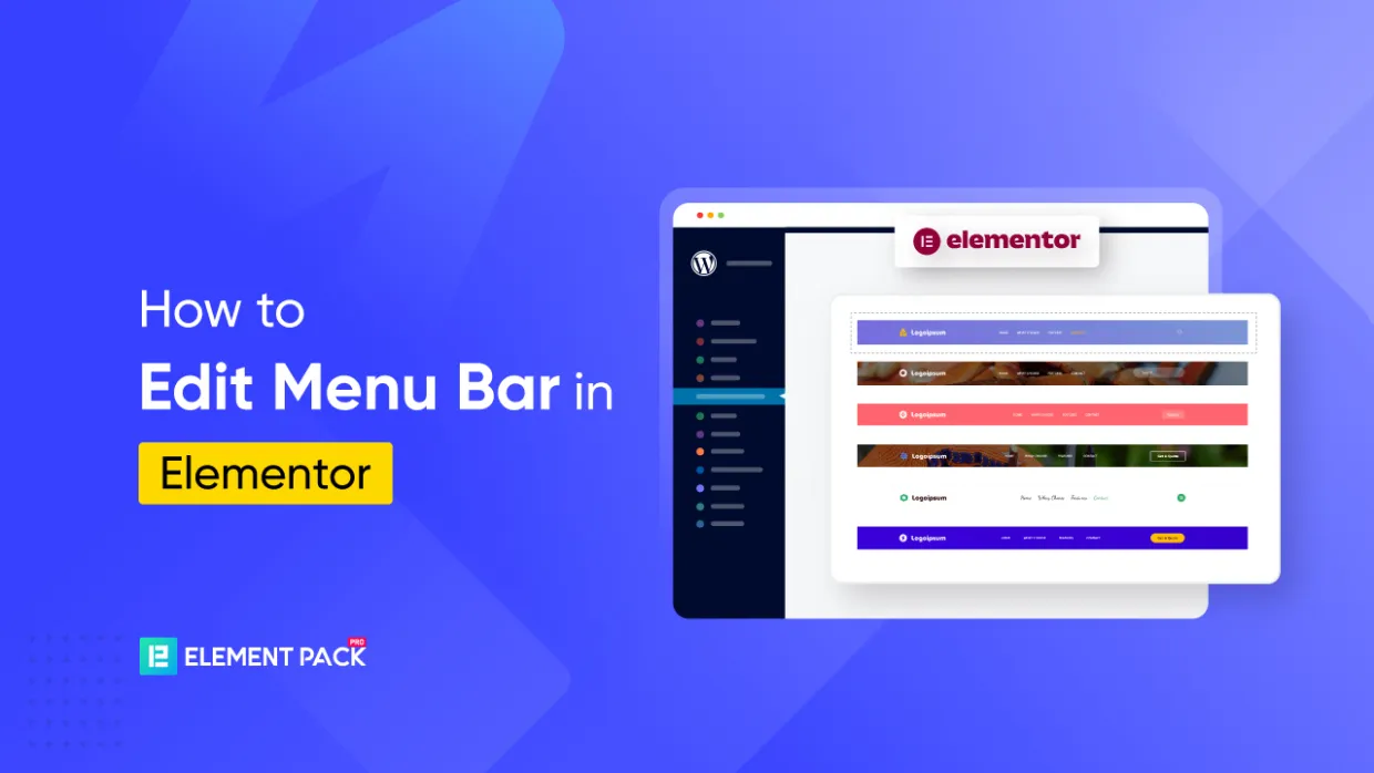
Building a website that reflects your brand starts with clear, user-friendly navigation. Yet many WordPress beginners struggle with editing the menu bar in Elementor.
By default, Elementor lacks advanced menu tools, leading to issues like menus not showing or poor mobile responsiveness.
So, what’s the solution? There’s a simple way to fix this.
と Element Pack, you can take full control of your Elementor navigation menu using the Mega Menu widget—no coding required.
Let’s dive in and unlock the full potential of your Elementor header builder using one of the most powerful features of the Element Pack navigation widget.
Why Use Element Pack Pro for Elementor Menu Bars?
Elementor’s default menu options can feel limited if you’re trying to create a fully customized or mega-style navigation bar. And, that’s where Elementor pack offers dedicated ウィジェット to create and edit menu bars in elementor quickly and easily without touching a line of code.
So, let’s break it down how element pack differs from basic elementor:
Default WordPress Menu vs Elementor Menu Bar
| 特徴 | Default WordPress Menu | Elementor Menu Bar (Pro) |
| Editing Style | Backend interface, non-visual | Simple drag-and-drop interface |
| Design Flexibility | Very limited, CSS required | Advanced visual styling possible |
| Icons & Badges Support | Not supported | Support natively (requires extra plugins) |
| Dropdown/Mega Menus | Basic dropdowns only | 上級 dropdowns; mega menus need third-party add-ons |
| Mobile Menu Control | 限定 | Control how menus behave on mobile |
| Requires Pro Version? | いいえ | Yes (for full responsive header menu editing capabilities) |
How to Create and Customize a Menu Bar in Just 6 Steps
So, to start editing the default menu bar, simply install Element Pack from its official site. Now that everything is set up, let’s walk through the complete process of building and customizing a menu bar in Elementor using the Element Pack Pro.
We’ll begin by creating the menu structure in WordPress and then customize it using Elementor and Element Pack’s Mega Menu widget .
Step 1: Create a Basic Menu in WordPress
Before creating a menu bar, you have to activate the necessary menu widgets in the element pack. To enable the menu bar feature:
- こちらへ Dashboard > Element Pack Pro > Other Settings
- Search for メガメニュー in the list
- Toggle the switch to On
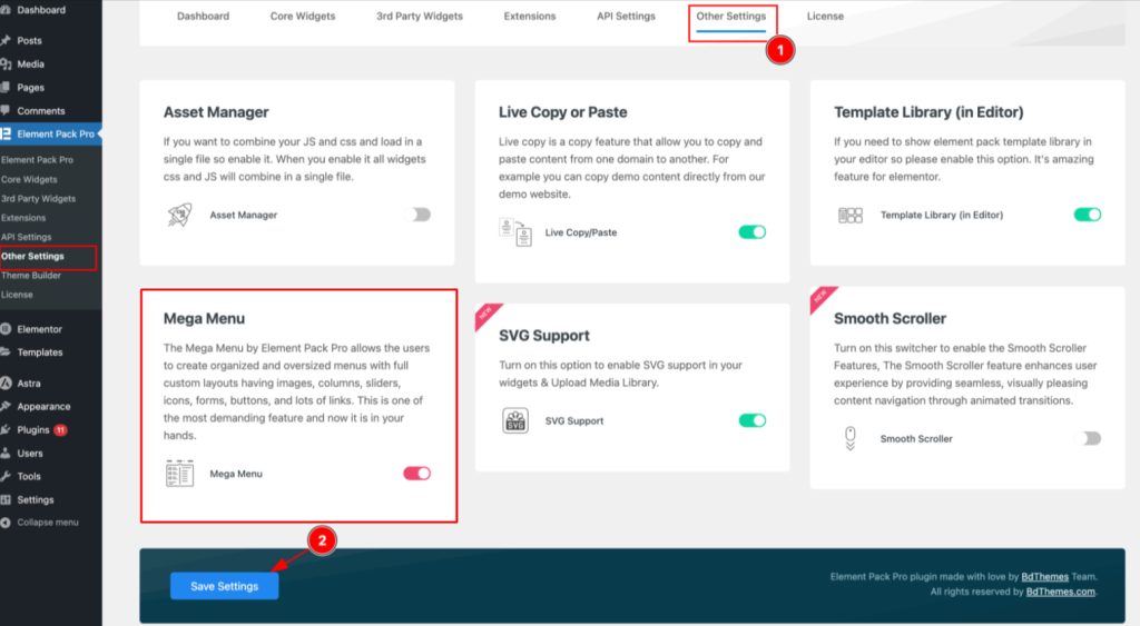
- クリック Save Settings
You’ve now enabled the menu widget inside your Elementor editor, which means you’re ready to edit navigation menus in Elementor using Element Pack Pro with full control—icons, animations, badges, and all!
So, now, lety’s create your base menu inside the WordPress dashboard.
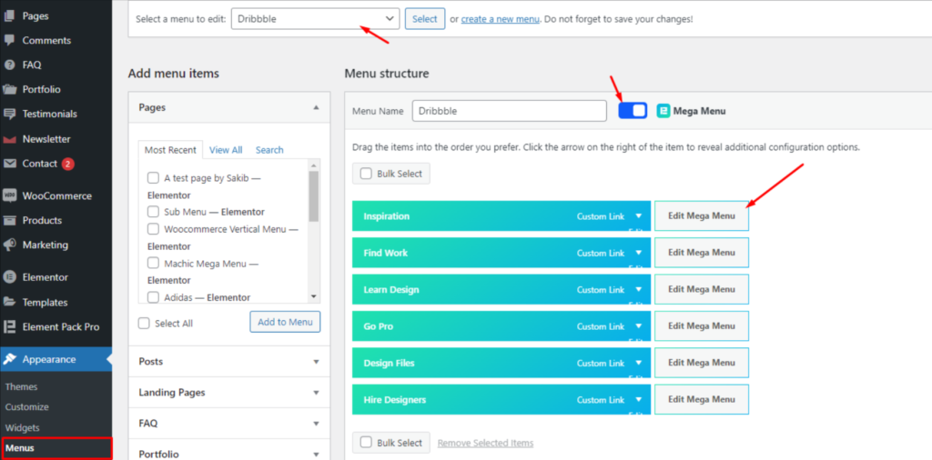
- こちらへ Dashboard > Appearance > Menus
- クリック Create a new menu
- 追加 Menu Name, then click メニュー作成
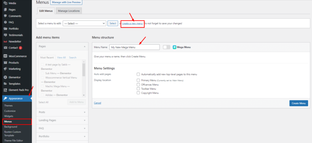
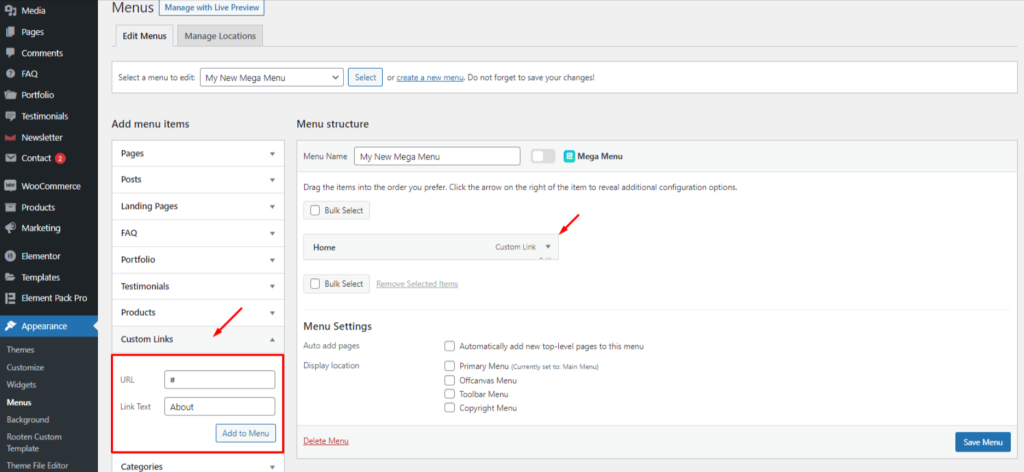
- Add menu items by selecting pages, posts, or custom links
- クリック Save Menu
Tip: Use meaningful link names like “Services,” “Shop,” or “Contact” to make your Elementor navigation menu user-friendly and clear.
Step 2: Enable the Menu Bar Toggle
Once your menu is created, it’s time to turn it into a menu bar powered by Element Pack.
- Look for the メガメニュー toggle beside the Menu Name フィールド
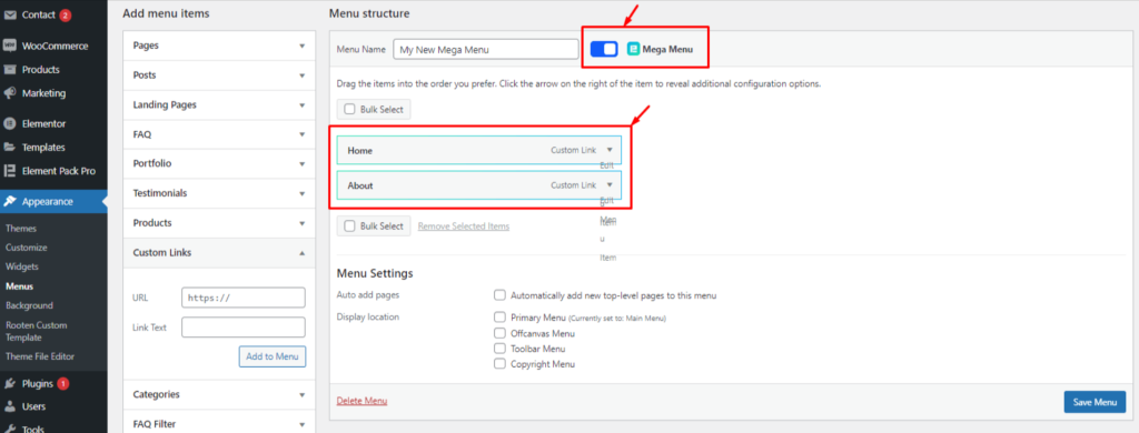
- Enable the switcher — once active, the menu items will glow green, indicating they’re now compatible for use with the Element Pack navigation widget
- Hover over any menu item and click on the small floating メガメニュー button that appears
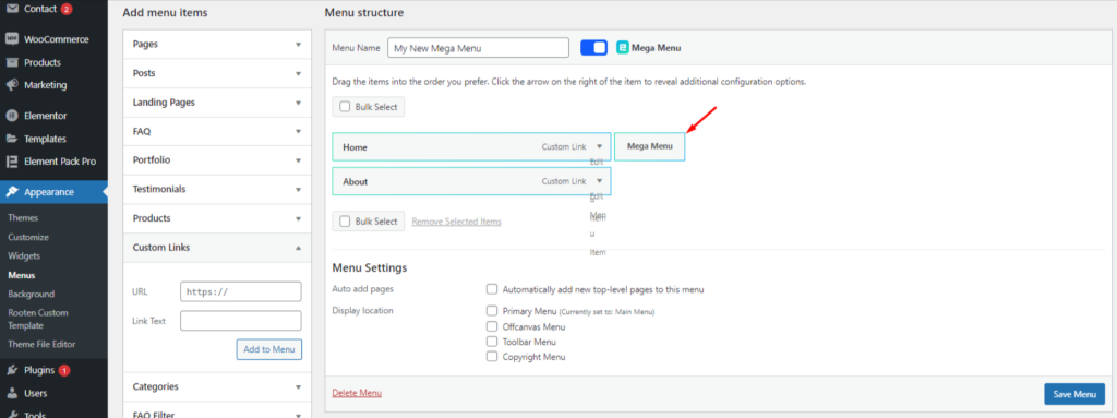
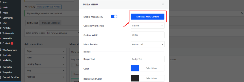
Step 3: Configure the Menu Bar Settings
Clicking that floating メガメニュー button will open a popup where you can configure key design settings for your menu bar:
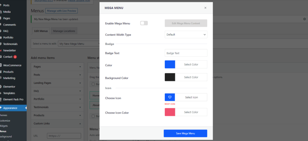
- Enable the メガメニューを有効にする switcher
- Set a custom width for the menu bar (default is 750px — you can increase it if needed)
- Choose the orientation — horizontal is common, but vertical works great for eCommerce layouts
- Add an アイコン または badge to the menu item for visual emphasis
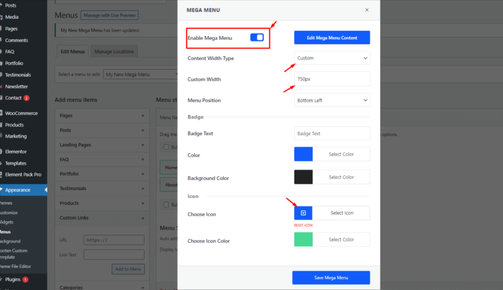
- クリック Save Mega Menu
These design tweaks are a big part of what makes Elementor menu customization so powerful. You get full visual control without touching code.
Step 4: Customize Menu Bar Content in Elementor
Once you’ve saved the settings, you’ll see a new option: Edit Mega Menu Content
- をクリックする。 Edit Mega Menu Content
- This will launch a fullscreen Elementor editor popup
- Now you can design the menu content just like any Elementor section:
- Add widgets like columns, イメージ, ボタンあるいは submenus
- Arrange layout with drag & drop flexibility
- Add widgets like columns, イメージ, ボタンあるいは submenus
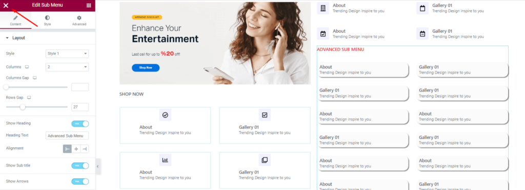
This approach brings all the power of Elementor’s visual interface to your menu bar design.
You’re not stuck with boring dropdowns anymore — think of your menu bar as a full design canvas.
Once you are done making the layout, click on the X icon at the top-left corner of this page.
Step 6: Insert the Menu Bar Widget on a Page
Now that your menu is designed and ready, it’s time to place it on your website:
- Open the target page with Elementor
- Search for メガメニュー in the widget panel
- Drag & drop the Mega Menu widget onto your layout
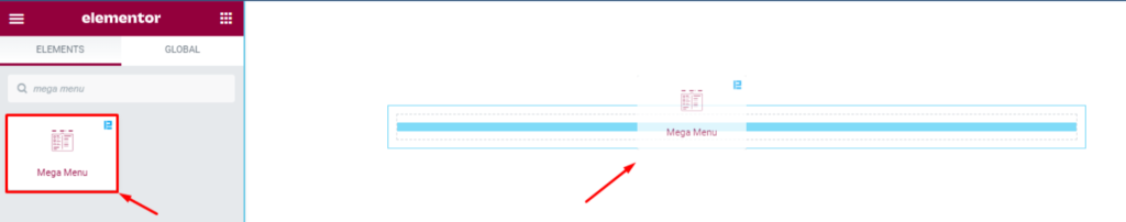
- From the widget settings, choose the menu you created earlier
And that’s it!
Your responsive menu bar in Elementor is now live and interactive.
You can further tweak display settings such as vertical layout, toggle menu, animations, and device visibility using the widget’s Content and Style tabs.
Fine Tuning Menu Bar With Customization Options
Now that your Elementor menu bar is in place using Element Pack Pro, it’s time to fine-tune its layout, behavior, and design.
Thanks to Elementor’s visual interface and the added power of the Element Pack Pro, you can fully control how your menu bar looks and responds on different devices — all without code.
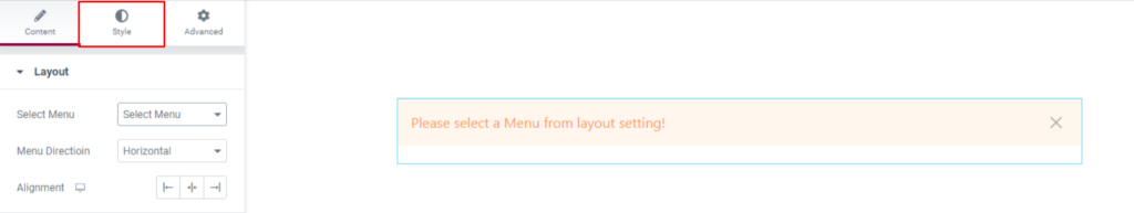
Layout Settings
Go to: Content > Layout
Here’s where you set the foundational layout of your menu bar.
- Menu Selection: From the dropdown, select the premade WordPress menu you created earlier.
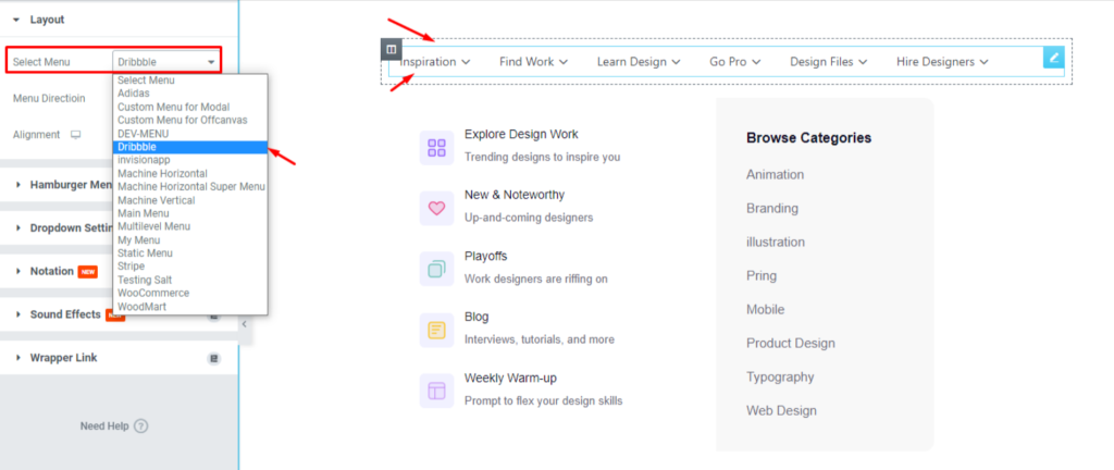
- Until you select it, the menu bar will display a message asking you to choose a menu.

- Orientation: Choose between Horizontal そして Vertical.

- Horizontal menus are standard for header sections.
- Vertical menus work well for sidebars or ecommerce layouts.
- Toggle Menu Option: Enable the トグル switcher to turn your menu bar into a collapsible menu, ideal for mobile and tablet views.

- This section also lets you customize the toggle heading, arrow icons, icon placement, offset, and animation settings.
This setup ensures you can create a responsive menu bar in Elementor that adjusts well to different devices.
Hamburger Menu Settings
Go to: Content > Hamburger Menu
This section is designed for mobile responsiveness. It ensures your menu remains accessible on smaller devices.

- You can enable or disable visibility on specific devices (tablet, mobile, etc.)
- Set the alignment of the hamburger icon (left, center, right)
- Customize spacing and layout behavior
This is especially important when working on a mobile menu in Elementor or resolving issues like the Elementor menu bar not showing correctly on smaller screens.
Dropdown Settings
Go to: Content > Dropdown Settings
Control how dropdown content behaves when a user interacts with your base menu items.

- Set the Offset Value to define the space between the base item and dropdown content
- Choose the Animation Type (e.g., fade, slide, etc.)
- Set Animation Duration to control the speed of the animation
- Define the Trigger Type as either Hover または クリック — depending on how you want users to access the dropdowns
Dropdowns are essential for a multi-level Elementor navigation menu, and these settings provide precise control over their appearance and interaction.
Styling the Menu (Style Tab Overview)
All design customizations happen under the スタイルタブ of the Mega Menu widget. Here’s how to control each component:
Menu Items
Go to: Style > Menu Items
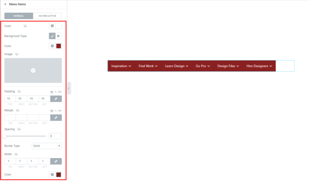
- カスタマイズ text color, background color, パディング, margin, bordersそして box shadows
- Set unique styles for hover states to make interactions more dynamic
- These controls apply to the visible base items of the Elementor menu bar
Dropdown Container
Go to: Style > Dropdown
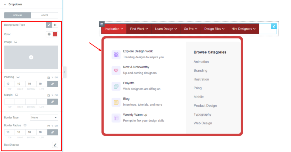
- Adjust the background color of the dropdown area
- 用途 パディング, margin, borderそして box shadow to define structure and spacing
- In cases where the inner content already has a white background, adding padding reveals the dropdown background more clearly
Hamburger Icon
Go to: Style > Hamburger Menu
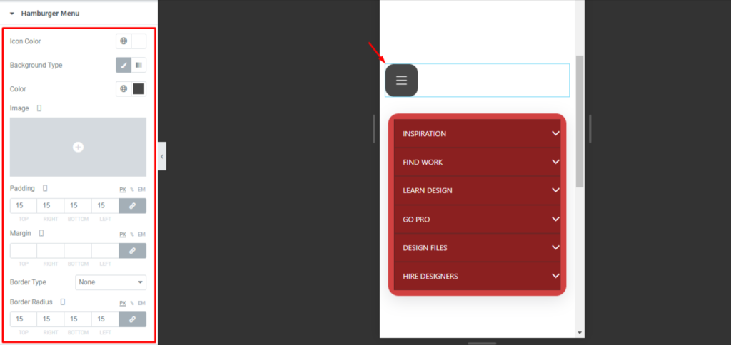
- Change the icon color, background, パディング, margin, and other visual properties
- This lets you ensure consistency across both desktop and mobile versions of your responsive header menu
Badges
To customize menu badges:
- From WordPress Dashboard > Appearance > Menus, click Edit Mega Menu beside the base menu item you want to label
- In the popup window, you can set the badge text, text colorそして background color
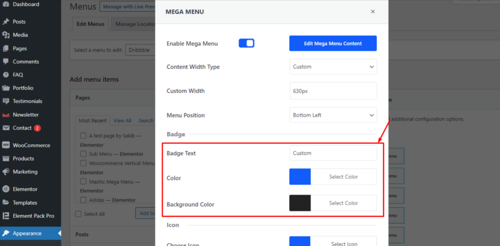
- Then return to Elementor and open the Mega Menu widget
- Go to: Style > Badge, where you can fine-tune the badge position, padding, margin, border, and radius
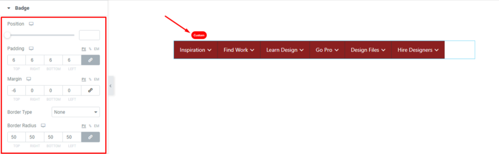
Badges are useful when working on Elementor header edit tasks where you need to highlight special menu items like “New,” “Sale,” or “Beta.”
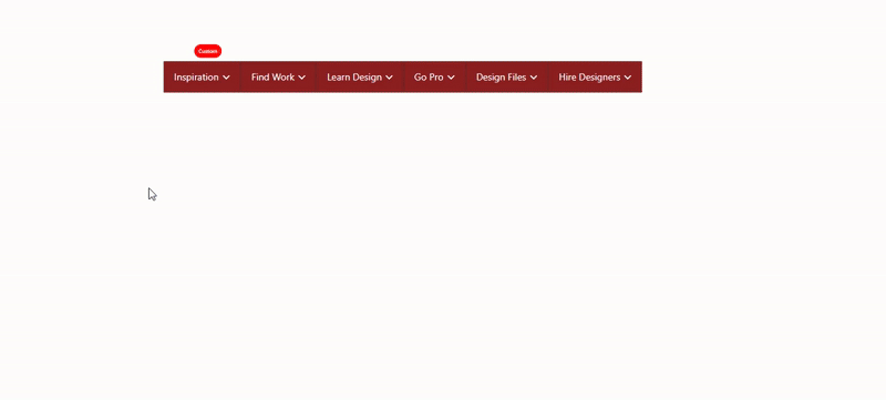
With these options, you’re designing an interactive, on-brand navigation system that works on every device.
The combined power of Elementor header builder and the Element Pack Pro navigation widget gives you next-level control and design flexibility.
Tips for Better Menu Bar Design and User Experience
A clean, responsive, and intuitive menu can significantly boost engagement and reduce bounce rates. Here are some essential design tips to elevate your WordPress menu design using Element Pack Pro and Elementor’s header builder.
Keep Menu Items Concise
- Keep main menu labels to one or two words
- Avoid clutter—aim for 5–7 top-level menu items
- Use clear, recognizable terms like “About,” “Services,” “Contact”
This improves scannability and ensures your Elementor navigation menu doesn’t overwhelm visitors.
Use Hover Animations for Feedback
- Enable hover animations under the Style > Menu Items tab
- Keep animations smooth and under 300ms to maintain responsiveness
This adds polish to your Elementor menu customization and enhances user feedback without feeling intrusive.
Stick to Clean Fonts and Spacing
- Use easy-to-read fonts (sans-serif works best for menus)
- Ensure enough horizontal spacing between items to prevent mis-clicks
- Maintain a visual hierarchy with font weights and sizes
These refinements are key when working on a custom header in Elementor and ensure accessibility across devices.
Make Sure Mobile Menus Are Fully Responsive
- を使用する。 Hamburger Menu settings under Content > Hamburger Menu
- Make sure your mobile menu in Elementor appears correctly across breakpoints
- Test visibility on mobile, tablet, and desktop devices
Tools like Chrome DevTools or BrowserStack can help you verify responsiveness before publishing.
Test Different Orientations Based on Layout
Depending on your site layout and content density, switching from a horizontal to a vertical menu bar might offer a better UX.
- Vertical menus work well for sidebars or ecommerce categories
- Horizontal menus are best for traditional header layouts
- Try different orientations under Content > Layout > Orientation
Experiment and gather feedback to find what aligns best with your user flow and content structure.
By following these tips, you ensure your menu bar is engaging, fast-loading, and tailored for modern browsing habits.
結論
Congratulations, you’ve now built a fully functional, custom menu bar in Elementor using the Element Pack Pro!
From setting up plugins and creating a menu in WordPress, to inserting and customizing the Mega Menu widget inside Elementor’s visual editor. This powerful combination allows you to build dynamic, responsive, and user-friendly navigation menus without writing a single line of code.
Design is an iterative process. Feel free to explore different layouts, fonts, icons, and menu triggers to match your brand’s identity.
With the flexibility of Elementor menu customization, the only limit is your creativity.
If you haven’t already, we highly encourage you to try Element Pack Pro, especially if you’re serious about creating a professional, fully customizable WordPress menu design that works seamlessly across all devices. It’s a must-have toolkit for anyone using Elementor.
よくあるご質問
Can I use the Mega Menu widget without Elementor Pro?
Yes, the Mega Menu works with the free version of Elementor, as long as you have Element Pack Pro installed and activated.
How do I make my Elementor menu responsive?
The hamburger menu settings in Element Pack allow you to show or hide menus based on device type and customize their look for better mobile usability.
How many menu items should I use for better UX?
Keeping your main menu between 5–7 items improves clarity and usability; use submenus to organize more complex structures.
Can I create different menus for desktop and mobile?
Yes, you can design unique responsive header menus using the visibility settings in Elementor and Element Pack for full control across devices.
Do badges and animations affect performance?
Not significantly, as long as you optimize your site; in fact, smart use of badges and hover animations can boost engagement and usability.