Elementor is the most used and highly customizable page builder for WordPress. However, there are some things that users do not find a direct option to change at some point.
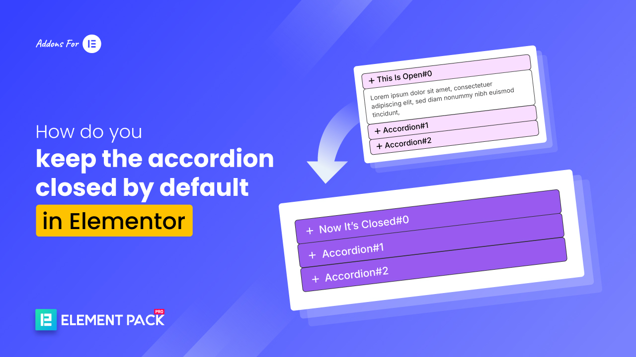
For example, the contents of the accordion widget are open by default. Many people want it to be closed, but they do not find the option to close it.
So, how do you keep the accordion closed by default in Elementor?
To keep accordion items closed by default in Elementor, go to the accordion widget’s コンテンツタブ >> Interaction. Use the “Default State” >> “All Collapsed” option, then 出版.
So here I am giving 3 easy methods for keeping the accordion closed by default in Elementor.
では、始めよう!
Reliable Ways to Keep Accordion Item Closed or Collapsed
When using Elementor’s accordion widget, the “first item”, or “first slide”, of the accordion is open by default. And the context is readable. But this may not be your preference.
As we have learned, Elementor does not provide any settings to close or collapse the accordion slide by default.
But don’t worry, because those were the old days. Now, you can close or open the accordion as you wish. Elementor now provides a built-in setting.
Also, after trying and testing, I found 2 more easy methods.
You can close or open the accordion using these 3 methods below.
- Method 1: Use Elementor’s Settings (Free Method)
- Method 2: Using a Simple CSS Code (Requires Elementor PRO)
- Method 3: Using JavaScript Code (For Advanced Users but Free)
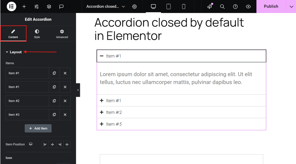
Method 1: Use Elementor’s Settings
This is the easiest solution to keep the Accordion Item Closed or Collapsed. It is available from Elementor’s built-in settings. It is also a coding-free beginner method. This is for free users of Elementor.
Let’s get started by following the steps here:
- Open your page in the Elementor editor, where you have the accordion section.

- Select an item in the accordion widget.

- In the left sidebar, go to the コンテンツタブ >> Interaction.
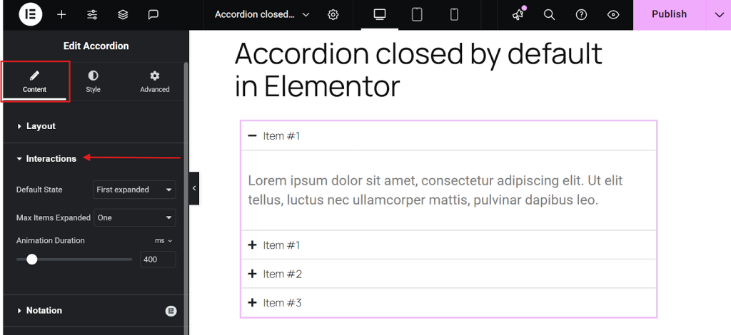
- Set the default state to All Collapsed.
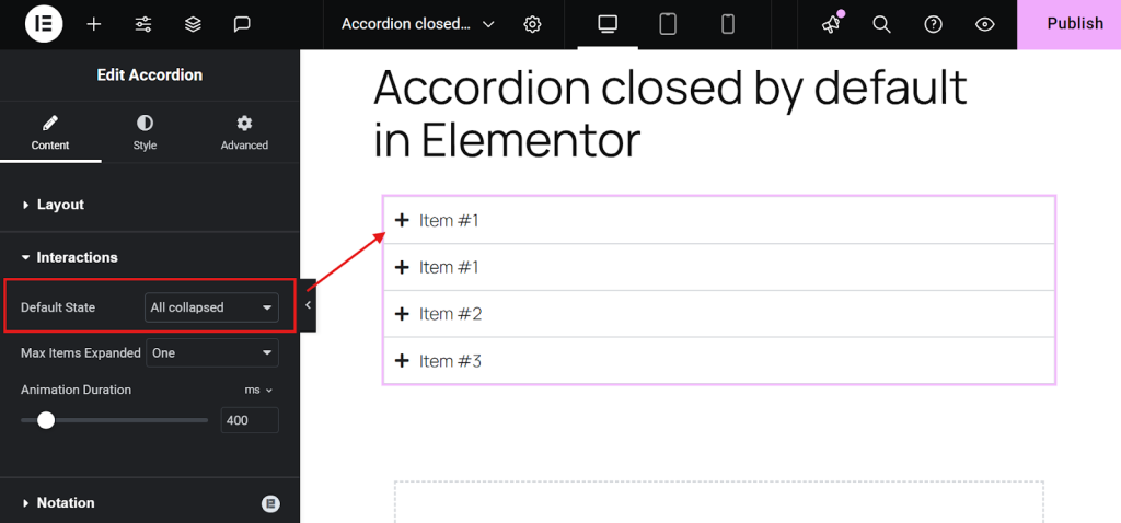
- 出版 今はね。
And that’s it!
ヒント Set Max Items Expanded to 1 (optional). It is highly recommended for a cleaner user experience. Feel free to tweak animation speed and icon styles to match your design.
Now, the big question! Does this work with the free version of Elementor?
Yes. It does! As long as you’re using the latest version. This feature is available in Elementor Free.
Method 2: Using a Simple CSS Code (Requires Elementor PRO)
If you’re working on older sites or templates where the built-in toggle isn’t available (pre-update), CSS offers a quick fix without redesigning. So, you can follow this method to keep the Accordion Item closed or collapsed. However, this is only for Elementor Pro users.
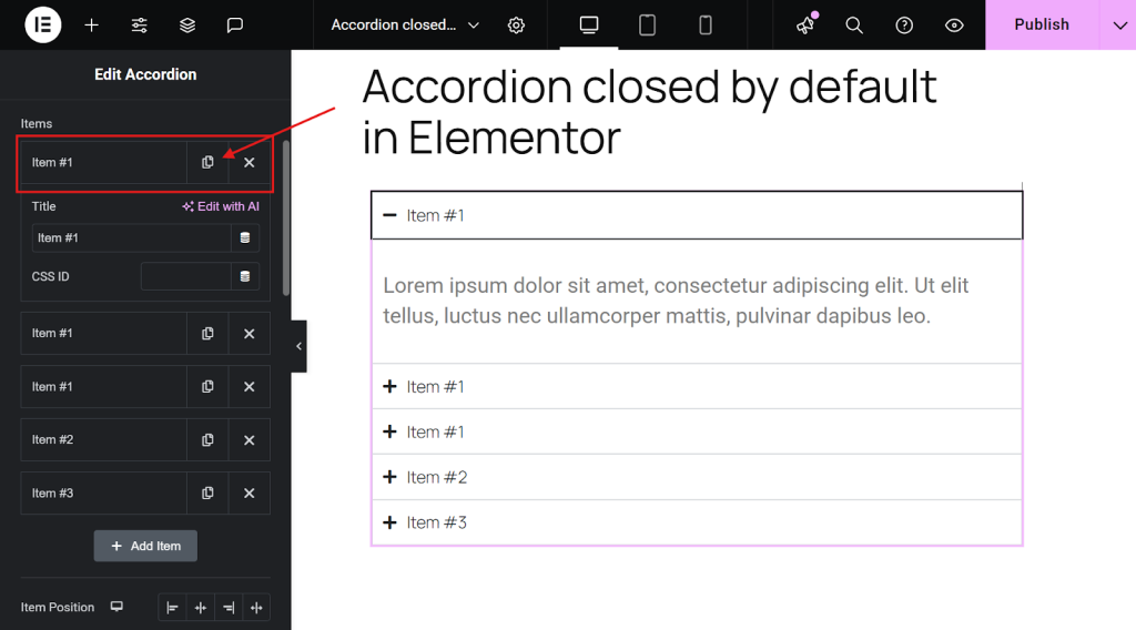
- Open your page in the Elementor editor, where you have the accordion section.

- Select the accordion widget.
- In the left sidebar, go to the コンテンツタブ >> Layout.
- Duplicate the very first accordion item (Please note – duplicate the first item, not the whole widget).
- Copy any of the below-provided CSS code
.elementor-accordion .elementor-accordion-item:first-of-type {

display: none;}

.elementor-accordion {

  border-top: 1px solid  #D4DFF2C7;

}- Go to the accordion widget’s Advanced tab.
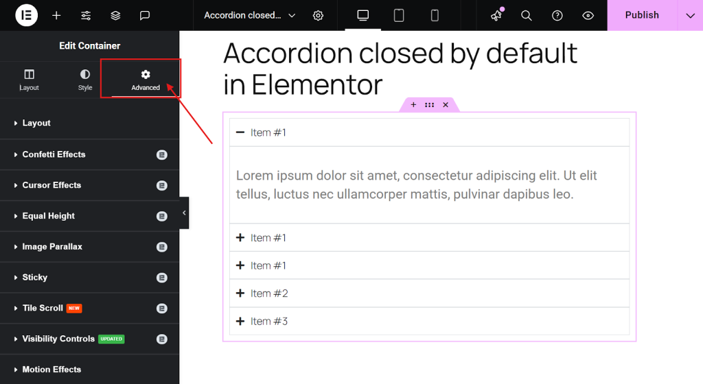
- Then, scroll down and paste the CSS code into the Custom CSS field.
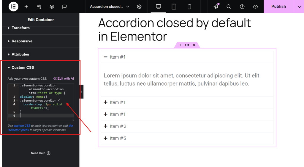
- Now, publish the page.
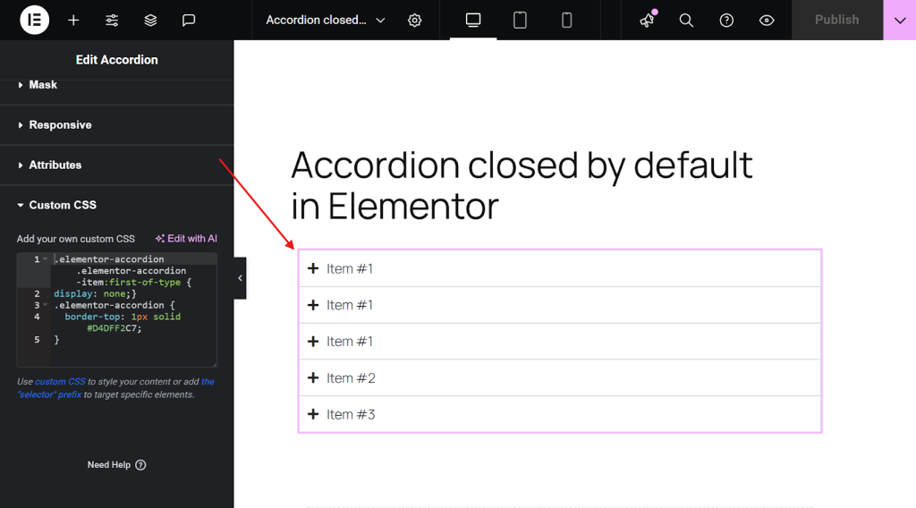
After updating the page by pasting the CSS, the first duplicated accordion item will be hidden, while the remaining items will be collapsed by default, just as you wanted.
Method 3: Using JavaScript Code
If you missed the first method due to version issues and the second method due to not having Elementor Pro, then follow this free method.
All you need to do in this method is add an HTML widget and a small code that will help you close the accordion. Here’s how to do it.
- Open your page in the Elementor editor, where you have the accordion section.
- Just above your accordion widget, place an “HTML Widget” from the elements panel.

- Copy the below-provided JavaScript code.
<script> jQuery(document).ready(function($) { var delay = 100; setTimeout(function() { $('.elementor-tab-title').removeClass('elementor-active'); $('.elementor-tab-content').css('display', 'none'); }, delay); }); </script>- Paste the above-provided JavaScript code inside the HTML Code.

- Once done, publish the page and see it live.

- Now, you’ll find that your first accordion starts closed.
プロのアドバイス Using multiple accordion widgets across your site, and want to apply the same functionality everywhere? Simply add the JavaScript snippet to Elementor > Custom Codes. This will make it work consistently across all pages and posts.
Bonus: 4 Premium Accordion Templates – Ready to Use
Why use Elementor’s basic accordion when you can easily get feature-rich, beautifully designed accordion templates?
Sure, Elementor’s default widget gets the job done. But if you’re aiming for a more dynamic, visually appealing experience, you’ll need something more advanced.
And the Elementor Pack accordion templates offer you a lot more. Like advanced styling, icon integration, animation control, and layout flexibility. They’ll instantly enhance your content presentation.
Whether you’re creating FAQs, service breakdowns, or interactive content sections, these premium templates save you time and provide a sleek look without the hassle of manual customization.
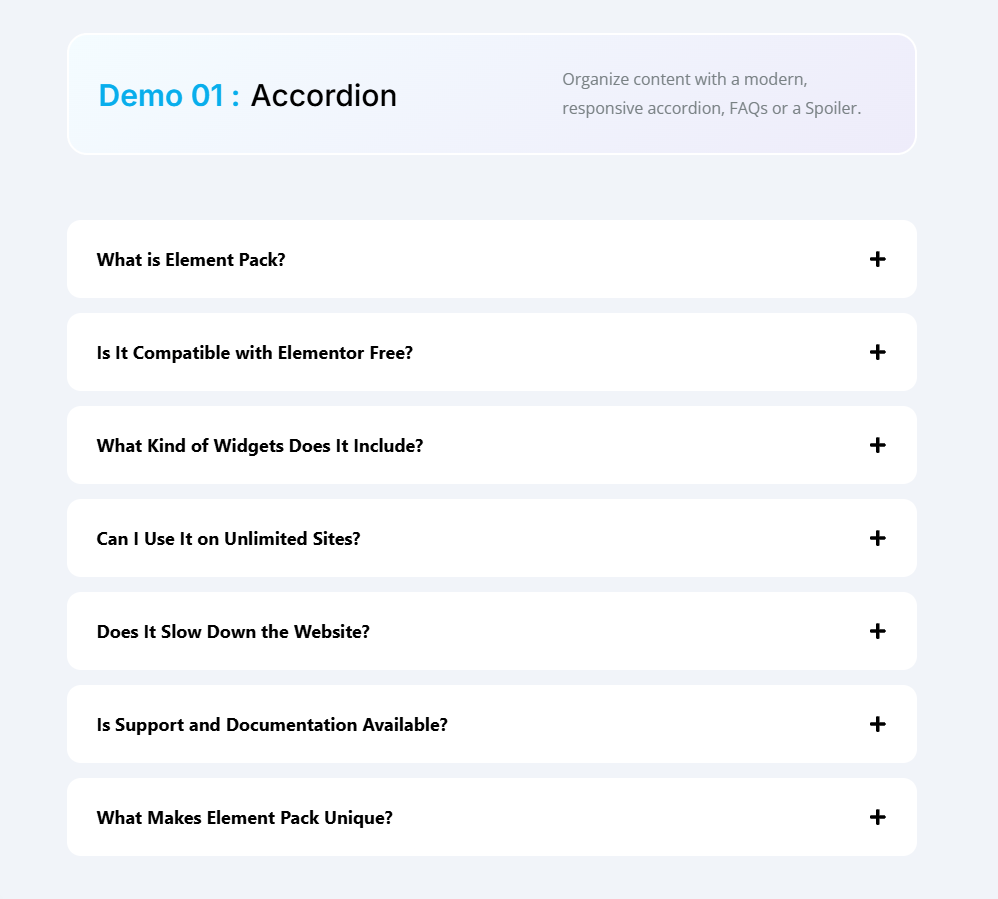
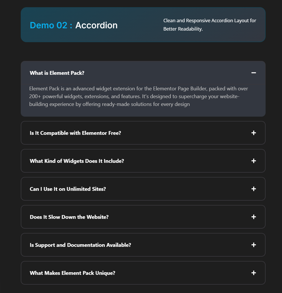
Here are 5 premium ready accordion templates from Element Pack:
Accordion 01: It is for organizing content with a modern, responsive accordion, FAQs, or a Spoiler.
Accordion 02: This is a clean and responsive accordion layout for better readability.
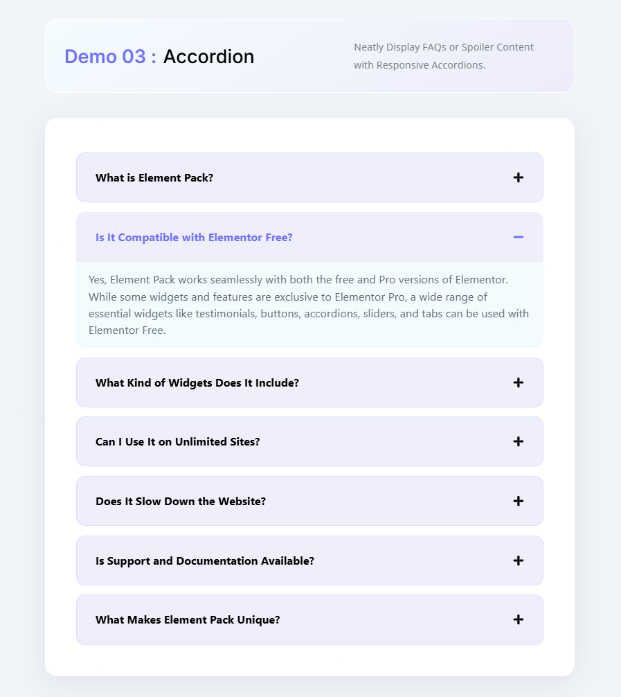
Accordion 03: Neatly display FAQs or spoiler content with a responsive Accordion.
Accordion 04: Effortless Content Management Using Modern Accordion Widgets.

Accordion 05: Provide seamless user navigation by enabling Hash-Based URLs that instantly open specific Accordion or Tabs on page load.
よくあるご質問
Q1. Should accordion items be open or closed by default?
It’s entirely up to your design preference. Many creators choose to keep the first accordion item closed to encourage user interaction. While others prefer it open to highlight key content. There’s no strict rule. Design it to suit your audience and layout goals.
Q2. What’s the difference between Toggle and Accordion widgets in Elementor?
While both widgets offer similar functionality. They behave differently on page load.
– Elementor Toggle widget: All items remain collapsed by default.
– Elementor Accordion widget: The first item is expanded, while the rest stay closed.
Additionally, accordion widgets allow only one item to be open at a time. Whereas toggle widgets let users open multiple items simultaneously.
Q3. Can I collapse Elementor accordion items without using code?
Yes! With the latest Elementor updates, you can simply enable the “All Collapsed” option under レイアウト >> Interactions, no coding required.
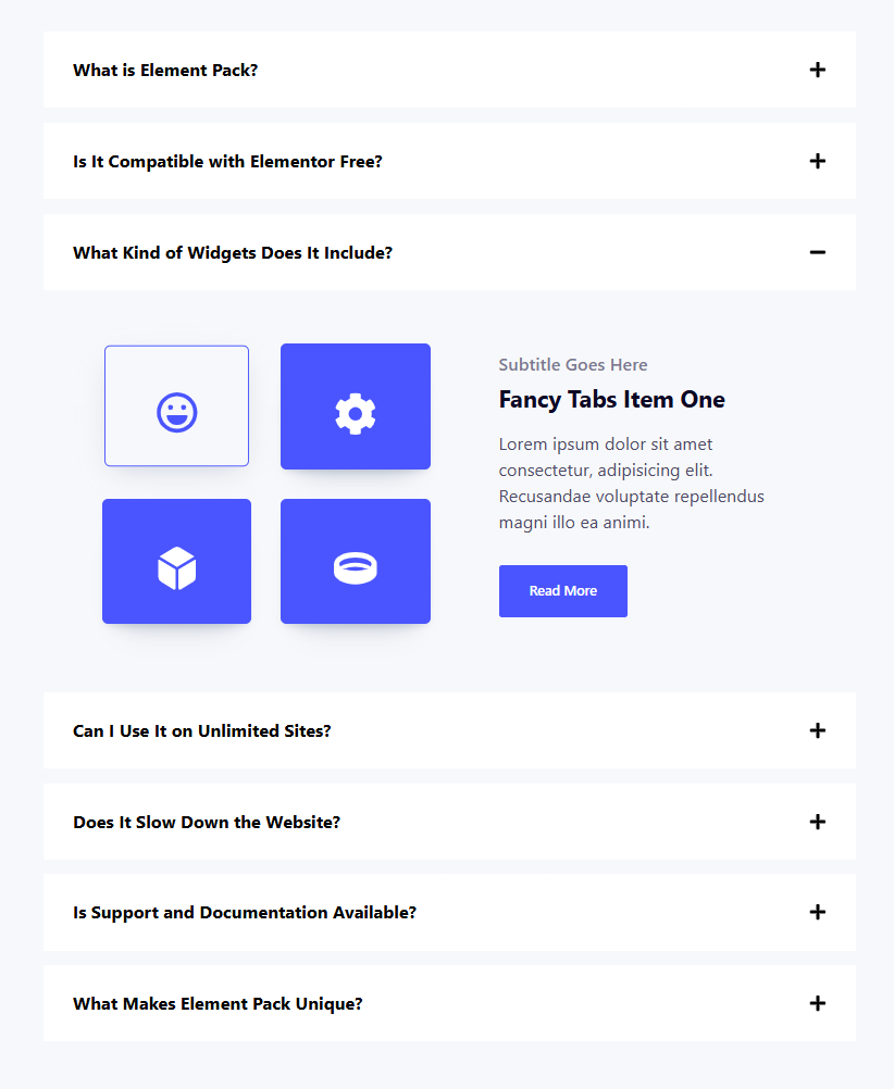
4. What is an Image Accordion in Elementor?
An Image Accordion displays multiple images in a collapsible format. Enhanced with hover effects and smooth animations. It’s a visually engaging widget that adds interactivity and flair to your design.
Last Word
If you are working with the latest version of Elementor. Elementor’s Default State setting is the easiest and most effective way to keep all Accordion items closed by default.
This method, with just a few clicks, ensures a clean experience. No custom code is required. This built-in feature is ideal for creators who want quick results without technical tweaks.
However, if you are using an older version of Elementor. You need more fine-grained control over how your Accordions behave. Such as targeting specific widgets, customizing animations, or ignoring theme conflicts. Then, using a JavaScript or CSS-based approach might be a better way.
And if you want to skip manual styling entirely, there is another smart option. You can use the ready-made Accordion templates available in Element Pack Pro.
These templates are professionally designed, fully responsive, and built with real-world usability in mind. Whether you’re creating FAQs, service breakdowns, or interactive content sections. These pre-built layouts save time and deliver smooth results.